Main Menu Navigation Links - by rj - on WordPress WooCommerce support

This topic has 9 replies, 3 voices, and was last updated 4 years, 8 months ago ago by Olga Barlow

  • Avatar: FastFormations
    rj
    Participant
    September 27, 2020 at 07:42

    Hi

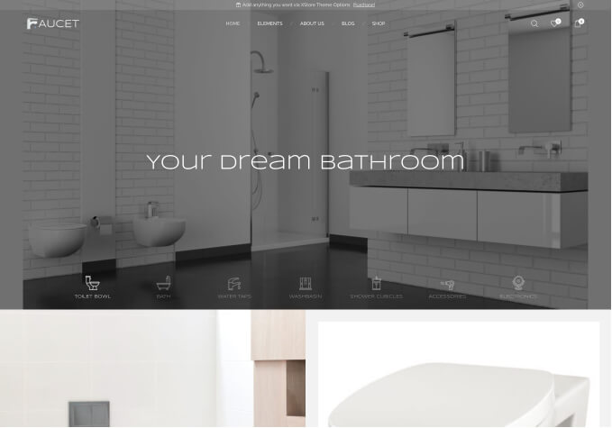
    How can I achieve this on main menu on desktop bottom header?

    https://prnt.sc/uom82b

    Please, contact administrator
    for this information.
    8 Answers
    Avatar: Rose Tyler
    Rose Tyler
    Support staff
    September 27, 2020 at 12:26

    Hi,

    Try to add the next code in Theme Options > Theme Custom CSS:

    .et_b_header-menu .menu li {
        min-width: 165px;
    }

    Regards

    Avatar: FastFormations
    rj
    Participant
    September 27, 2020 at 12:33

    Hi

    But its not responsive. When you reduce the size of window, the submenu overlaps with main menu and does not work.

    https://prnt.sc/uoph52

    Avatar: FastFormations
    rj
    Participant
    September 27, 2020 at 13:00

    I mean I want it to be functional at any resolution above 992px…
    But for example, try to open sub menu of HOME at the resolution of 1000px, you will not be able to click on its submenu.

    Avatar: Rose Tyler
    Rose Tyler
    Support staff
    September 27, 2020 at 13:08

    Delete the previous code.
    Add the next one in Custom CSS for desktop area:

    .et_b_header-menu > .menu-main-container, .et_b_header-menu > .menu-main-container > ul {
        width: 100%;
    }
    .et_b_header-menu > .menu-main-container > ul {
        justify-content: space-around;
    }
    .et_b_header-menu > .menu-main-container > ul > li {
        flex: 1;
    }
    .et_b_header-menu > .menu-main-container > ul > li > a {
        white-space: nowrap;
    }

    Regards

    Avatar: FastFormations
    rj
    Participant
    September 27, 2020 at 13:36

    Thanks alot!

    Can you please also give me same settings for top header also?

    https://prnt.sc/uoq95q

    Avatar: Rose Tyler
    Rose Tyler
    Support staff
    September 27, 2020 at 14:55

    Change alignment of elements https://prnt.sc/uor8qz https://prnt.sc/uor8yt , margin you can add here – https://prnt.sc/uor9ke

    Regards

    Avatar: FastFormations
    rj
    Participant
    September 27, 2020 at 15:08

    Actually I have already tried all the settings of margin, padding and alignment (whole row as well as separate blocks). The current setting is the best possible setting to keep all the elements visible till 1150 px..
    below 1150 to 992 px, its not working… so I just thought there might be some solution by adding CSS code… as how you did for bottom header.

    Avatar: Olga Barlow
    Olga Barlow
    Participant
    September 28, 2020 at 12:24

    Hello,

    Alignments of the elements in top, main and bottom areas are different, so there is no CSS solution to add the same space for all the devices, it will change depending on the device width. Try to add the padding-right and padding-left 4% for the top header. It won’t be perfect but very close to what you want.

    Regards

  • Viewing 9 results - 1 through 9 (of 9 total)

The issue related to '‘Main Menu Navigation Links’' has been successfully resolved, and the topic is now closed for further responses

Helpful Topics

We're using our own and third-party cookies to improve your experience and our website. Keep on browsing to accept our cookie policy.