Logo sizes, Page Titles, Missing Items and Store Page

This topic has 21 replies, 3 voices, and was last updated 9 years, 8 months ago ago by Eva Kemp

  • Avatar: rwlee33
    rwlee33
    Participant
    July 26, 2014 at 08:21

    Hi Eight Theme team,

    I recently downloaded the Legenda theme and I think it’s brilliant! Thanks for doing such a great job.

    I’m trying to do a few things and can’t seem to get the custom css to work.

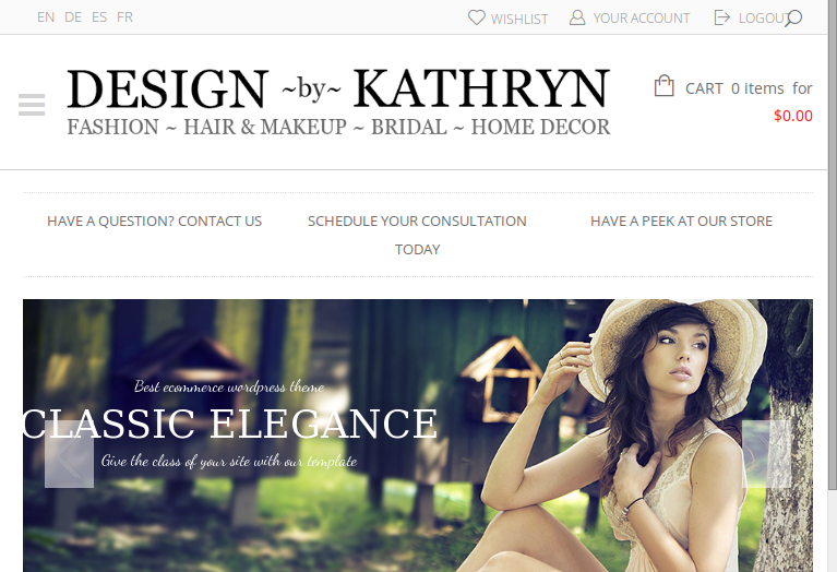
    1. Increase the size of the logo in the header and mini header after scroll
    I tried the custom css:

    .header 1 .logo-with-menu { width: 300px;}
    .header 1 .main-nav .menu {width: 600px;}

    But that didn’t seem to work. Can you take a look?

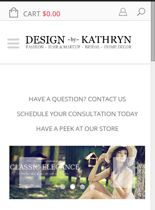
    2. Is there a way to remove the title of the page and the horizontal bar from below the header? The breadcrumbs and “return to previous page are ok, but the Page Title takes up space and is redundant if the breadcrumbs are there.

    3. Wishlist, Your Account and Logout are missing from the upper right corner. They are activated, is there something else preventing them from showing?

    4. I loaded the demo content, but didn’t see a store page, or store plugin. What do I need to do to load this up?

    Thanks in advance for the help! http://www.designbykathryn.com

    Please, contact administrator
    for this information.
    20 Answers
    Avatar: Eva
    Eva Kemp
    Support staff
    July 26, 2014 at 10:18

    Hello,

    1. To make the logo bigger you need add this code into custom.css file:

    .header5 .logo img, .header6 .logo img, .header1 .logo img, .header7 .logo img {
        max-width: 400px;
    }
    .fixed-header-area .fixed-header .logo-with-menu {
        width: 300px;    }

    2. To remove the title use this code:
    .page-heading h1 {display: none;}

    3. To make Wishlist link display you need have Woocommerce plugin installed. Please install it. Also you need create Register page as described in our documentation: https://www.8theme.com/demo/docs/legenda/index.html#!/registration_page

    4. You need Woocommerce plugin. You should had installed it before theme activation as described here: https://www.8theme.com/demo/docs/legenda/index.html#!/installation
    Please note there may be some problems as you’re going to install the plugin after the theme activation.
    If you notice some issues you’ll have to reinstall everything on clean WordPress following the instructions in our documentation.

    How to create custom.css file you can watch here: https://www.youtube.com/watch?v=Qok2zRedRMY

    Regards,
    Eva Kemp.

    Avatar: rwlee33
    rwlee33
    Participant
    July 26, 2014 at 13:24

    Thank you, I just did a fresh install and followed the documentation.

    One thing. WHen I disable the search from the header, for the first header theme, the logo gets moved to the left. Is there a way to disable search in the header, but keep the logo centered?

    Thanks!

    Avatar: rwlee33
    rwlee33
    Participant
    July 26, 2014 at 14:15

    Sorry, also, the code you provided for the logo sizing didn’t seem to do anything 🙁

    Avatar: Eva
    Eva Kemp
    Support staff
    July 26, 2014 at 16:58

    Hello,

    Please provide us with the correct login credentials.
    Thank you.

    Regards,
    Eva Kemp.

    Avatar: rwlee33
    rwlee33
    Participant
    July 27, 2014 at 01:38

    Sorry, the last user was removed when I did the fresh install

    Please, contact administrator
    for this information.
    Avatar: Eva
    Eva Kemp
    Support staff
    July 27, 2014 at 13:27

    Hello,

    Please add this code in custom.css file to center the logo when search form widget is disabled:

    @media(min-width:980px) and (max-width:1199px){
     .header5 .logo, .header6 .logo, .header1 .logo, .header7 .logo {
      position: relative;
      left: 325px;
     }
    }
    
    @media(min-width:1200px){
     .header5 .logo, .header6 .logo, .header1 .logo, .header7 .logo {
       position: relative;
       left: 330px;
       float:left !important;
     }
    }

    Please make sure you have Custom CSS enabled in Theme Options. How to create custom.css file you can watch here: https://www.youtube.com/watch?v=Qok2zRedRMY

    And try to add this code again to make the logo bigger:

    .header5 .logo img, .header6 .logo img, .header1 .logo img, .header7 .logo img {
        max-width: 400px !important;
    }
    .fixed-header-area .fixed-header .logo-with-menu {
        width: 300px !important;    }

    Regards,
    Eva Kemp.

    Avatar: rwlee33
    rwlee33
    Participant
    July 28, 2014 at 00:30

    Hi, thanks for the help.

    I renamed the style sheet to remove “default” and the code you supplied is now taking effect.

    A few things that are now occurring.

    1. The logo is now too large for the mobile version, even at 400px. It does not resize properly.

    Can you provide code to ensure that the mobile version resizes properly?

    2. If I remove the search from the header, and want the header logo to be more than 400px wide, it’s not centered, just moved to the right 325px as per your code.

    Can you provide some code so that the logo isn’t just moved over, but actually centered?

    3. If I remove the search from the header, the mobile version doesn’t display the account/login icon properly, it’s moved half a line down.

    At this point, it seems like a headache just to remove the search from the header, so I’m going to leave it in. However, I thought you’d like to know what it does to the theme.

    For now, I just need a way to make the logo larger, but with the ability to make sure it is sized properly in mobile view. Point #1 above.

    Thanks!

    Avatar: Eva
    Eva Kemp
    Support staff
    July 28, 2014 at 08:22

    Hello,

    Please specify what size you want the logo to be on mobile and desktop variants?
    After that we’ll correct its displaying.
    As I understood you’ll keep search form widget on, won’t you? Please confirm to be sure what modifications we should make.

    Thank you.

    Regards,
    Eva Kemp.

    Avatar: rwlee33
    rwlee33
    Participant
    July 28, 2014 at 08:36

    Hi, thanks for the reply!

    For the mobile logo size, I preferred the width of the original stock “Legenda” logo. That seemed to look alright in mobile mode.

    And yes, I’ll keep the search widget in the header. I decided that removing the search widget caused too many other complications (mobile icons displaced, header logo not centered, etc).

    Thanks!

    Avatar: Eva
    Eva Kemp
    Support staff
    July 28, 2014 at 10:08

    Hello,

    The logo size on your site is the same as on the demo – 215px on mobile devices. If you want to increase it you need use this code in custom.css:

    @media (max-width: 767px) { .logo img {
        max-width: 215px !important;
    }}

    Change the value to what you want.

    Regards,
    Eva Kemp.

    Avatar: rwlee33
    rwlee33
    Participant
    July 28, 2014 at 11:34

    Hi Eva,

    So the previous code you sent actually increased the size of the logo. I set it to 400 and 300.

    .header5 .logo img, .header6 .logo img, .header1 .logo img, .header7 .logo img {
    max-width: 400px;
    }

    .fixed-header-area .fixed-header .logo-with-menu {
    width: 300px !important; } */

    The problem with this, is that it increases the logo in the mobile version too. I’m not sure where to put the new code you sent:

    @media (max-width: 767px) { .logo img {
    max-width: 215px !important;
    }}

    and if I should keep the previous code. Can you please advise? Thanks!

    Thanks!

    Avatar: Jack Richardson
    Jack Richardson
    Support staff
    July 28, 2014 at 11:41

    Hello,

    As we can see code is added correctly. Do you experiencing any problems at the moment?

    Regards,
    Jack Richardson

    Avatar: rwlee33
    rwlee33
    Participant
    July 28, 2014 at 11:58

    Yes, sorry. It appears that the mobile version is ok.

    Can you tell me the difference between these two set of custom css?

    .header5 .logo img, .header6 .logo img, .header1 .logo img, .header7 .logo img {
    max-width: 400px;
    }

    .fixed-header-area .fixed-header .logo-with-menu {
    width: 300px !important; }

    —-

    @media (max-width: 767px) { .logo img {
    max-width: 215px !important;
    }}

    Avatar: Jack Richardson
    Jack Richardson
    Support staff
    July 28, 2014 at 12:02

    Hello,

    The first set of code is used to set up logo width on desktop devices and the second for mobile devices.

    Regards,
    Jack Richardson

    Avatar: rwlee33
    rwlee33
    Participant
    July 30, 2014 at 08:09

    Thanks for all the help. It’s looking good, but I have another question.

    When the logo is in desktop mode, it’s an appropriate size. When it goes into mobile mode, it shrinks drastically. It’s quite small. Can you help provide some custom css to size the logo in mobile mode? Thanks!

    Avatar: Eva
    Eva Kemp
    Support staff
    July 30, 2014 at 08:16

    Hello,

    Your logo is showing fine on mobile device:

    Do you want to make it bigger?
    Please show us a screenshot of what you see on your side.
    Thank you.

    Regards,
    Eva Kemp.

    Avatar: rwlee33
    rwlee33
    Participant
    July 30, 2014 at 08:22

    Hi Eva,

    It looks fine on the phone in portrait mode, but in landscape, or on a tablet, it’s the exact same size, which is fairly small in those views.

    Is there any way for it to be responsive enough to expand when it’s not in the smallest mobile portrait mode?

    Please, contact administrator
    for this information.
    Avatar: Eva
    Eva Kemp
    Support staff
    July 30, 2014 at 08:31

    The logo is showing fine on tablets as well:

    Are you checking it with browser resizing or on mobile devices?
    Please show us screenshots.

    Thank you.

    Regards,
    Eva Kemp.

    Avatar: rwlee33
    rwlee33
    Participant
    July 30, 2014 at 08:38

    Thank you, I see. I’m checking with landscape mode on my phone and browser resizing. I can’t screenshot at the moment, but I will test out again in a few hours and send screenshots.

    Thanks again (sorry for the minor issues, but I really appreciate it!)

  • 1 2
    Viewing 20 results - 1 through 20 (of 21 total)

You must be logged in to reply to this topic.Log in/Sign up

We're using our own and third-party cookies to improve your experience and our website. Keep on browsing to accept our cookie policy.