Hi,
pls look at these two screenshots:
1. http://prntscr.com/96es3w
2. http://prntscr.com/96es9z
I want to achieve the following:
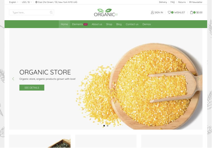
1. The logo is not resizes automatically, it should be central in the middle and not cut. How? (1st screenshot)
2. The basket on top is too low and should be aligned with the account in the middle of the top green banner (1st screenshot)
3. The text of the dropdown menu is dark grey on black background. How can i change both colours? (not visible on screenshot)
4. There is a huge white space between the bestseller widget on top and the new in at the bottom. How can i reduce this white space? I already fixed that only 2 items are shown but the white space still exists… (2nd screenshot)
Thanks for your help
Stefan

