Logo and hamburger menu position - by designerobot

This topic has 12 replies, 3 voices, and was last updated 5 years, 6 months ago ago by Rose Tyler

  • Avatar: designerobot
    designerobot
    Participant
    September 13, 2018 at 13:24

    Hello,

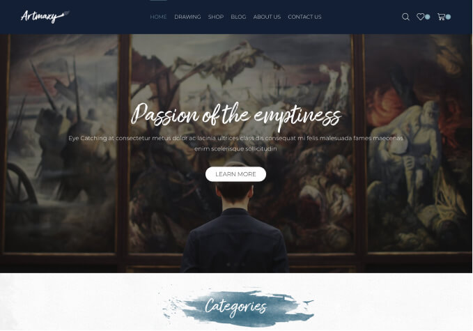
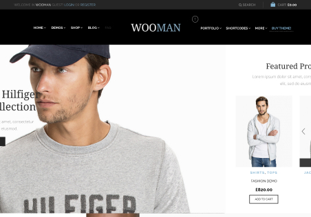
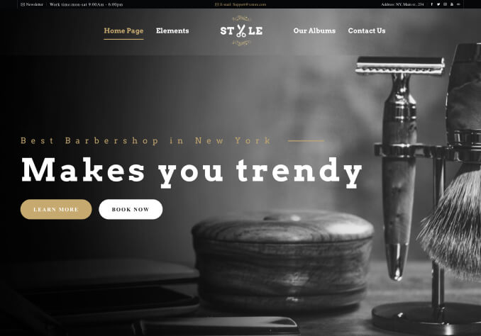
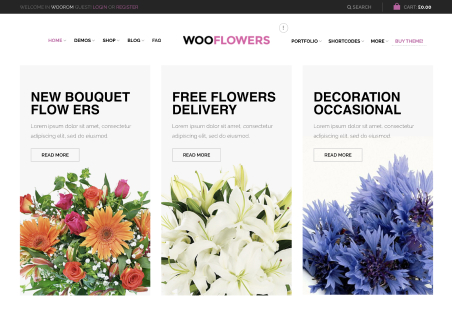
    In the desktop version I’ve the logo on the left and the main menu on the right. I like this layout.

    In the mobile version I’ve the logo in the center and the hamburger menu on the left.

    I would like to have the same position of these elements (logo and menu) both in desktop and mobile version.

    Therefore, how I can move (in the mobile version) the logo from the center to the left and the hamburger menu from the left to the right?

    Please, contact administrator
    for this information.
    11 Answers
    Avatar: Rose Tyler
    Rose Tyler
    Support staff
    September 13, 2018 at 13:39

    Hello,

    Try to add this code in Global Custom css:

    @media only screen and (max-width: 992px) {
        #st-trigger-effects {
            left:  unset;
            right: 0px;
        }
        .header-logo {
            left: 31%;
        }
    }

    Regards

    Avatar: designerobot
    designerobot
    Participant
    September 13, 2018 at 16:49

    Hello, I tried but nothing happens.

    Avatar: Rose Tyler
    Rose Tyler
    Support staff
    September 14, 2018 at 07:20

    Hello,

    Please use this code:

    @media only screen and (max-width: 992px) {
        #st-trigger-effects {
            left: unset !important;
            right: 0px;
        }
        .header-logo {
            left: 31% !important;
        }
    }

    Do not forget to clear cache before cheking the result.
    Let us know the result.

    Regards

    Avatar: designerobot
    designerobot
    Participant
    September 14, 2018 at 11:43

    Hello, thanks for the help.
    In this way it works but:

    1. The logo is not perfectly aligned on the left, like the other elements of the page. It is a bit shifted to the center. I tried to change 31% with other numbers but it’s impossible to obtain a perfect alignment in this way in every case of the page width.

    2. The logo is too big in this position in the mobile version, it should be a bit smaller.

    3. The hamburger menu icon is not perfectly aligned on the right, like the other elements of the page

    4. The hamburger menu icon is too smaller in this position, it should be a bit bigger.

    5. The hamburger menu icon is now in the position I wanted (on the right), but if I click or touch it, the mobile menu is still opened on the other side of the page, namely on the left instead of on the right

    What do I need to change to solve these five issues?

    Avatar: Olga Barlow
    Olga Barlow
    Support staff
    September 14, 2018 at 15:34

    Hello,

    Check now.

    Regards

    Avatar: designerobot
    designerobot
    Participant
    September 14, 2018 at 16:55

    Hello,

    Now it’s perfect. It’s exactly as I wanted it. Thank you very much for the help!!!

    Avatar: designerobot
    designerobot
    Participant
    September 14, 2018 at 19:08

    I would like to ask you the last question about this matter.

    Now when I click on the hamburger menu (on the right) the menu appears on the right and shift from to right to left to arrive in its position. This is what I wanted and I’m happy.

    At the same time, the page becomes transparent and starts to move. It shifts too, from right to left in this case. What I want is: could the page remain steady without any movement?

    Namely, I would like that the menu arrives above the pages and covers only the small right part of the page (the other part remains steady and becomes only transparent like now).

    Avatar: designerobot
    designerobot
    Participant
    September 17, 2018 at 14:47

    Hello, have you seen this last reply?

    Avatar: Olga Barlow
    Olga Barlow
    Support staff
    September 17, 2018 at 16:28

    Hello,

    Check now.

    Regards

    Avatar: designerobot
    designerobot
    Participant
    September 17, 2018 at 17:10

    Hello Holga,

    Thanks, now it works perfectly.

    Regards

    Avatar: Rose Tyler
    Rose Tyler
    Support staff
    September 18, 2018 at 07:11

    Hello,

    You’re welcome!

    Regards

  • Viewing 12 results - 1 through 12 (of 12 total)

The issue related to '‘logo and hamburger menu position’' has been successfully resolved, and the topic is now closed for further responses

We're using our own and third-party cookies to improve your experience and our website. Keep on browsing to accept our cookie policy.