Line through slider on mobile - by Bambool2015

This topic has 4 replies, 3 voices, and was last updated 8 years, 6 months ago ago by Robert Hall

  • Avatar: Bambool2015
    Bambool2015
    Participant
    September 24, 2015 at 18:17

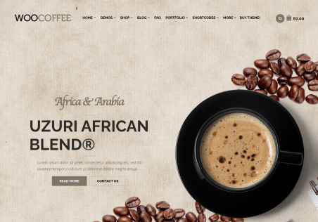
    Hi – when the screen size goes to 768 (media query) the line that is behind the “Shop – New Arrivals” jumps up to the middle of the revolution slider. I removed all of my custom CSS to test if that was causing a problem, but it was still there.

    Thank you

    3 Answers
    Avatar: Jack Richardson
    Jack Richardson
    Support staff
    September 28, 2015 at 10:44

    Hello,

    Unfortunately I don’t see any issues.
    Please show a screenshot of your problem.

    Best regards,
    Jack Richardson.

    Avatar: Bambool2015
    Bambool2015
    Participant
    September 28, 2015 at 20:46

    Here is a link to a screenshot. http://www.bamboolthermics.com/wp-content/uploads/2015/09/bamboolthermics-white-line-from-Shop.png

    Notice it is the line from the Shop – Featured section that has floated up right at 768px.

    Thank you

    Avatar: Robert Hall
    Robert Hall
    Support staff
    September 28, 2015 at 20:57

    Hello,

    Please add this code in Custom CSS for tablet (Theme Options->Custom CSS).

    .products-tabs .wpb_tabs_nav:before {
        border-top: none;
    }

    Regards,
    Robert Hall.

  • Viewing 4 results - 1 through 4 (of 4 total)

You must be logged in to reply to this topic.Log in/Sign up

We're using our own and third-party cookies to improve your experience and our website. Keep on browsing to accept our cookie policy.