Hello Team,
I hope you’re doing well.
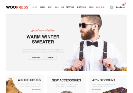
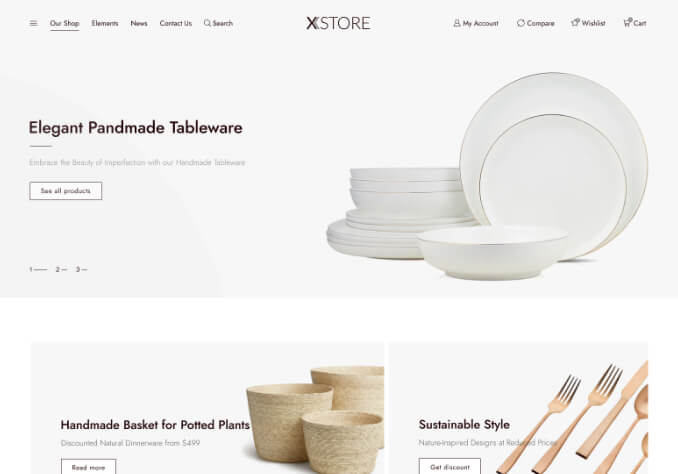
I’m facing an issue with the hero banner on my website built using the XStore theme. I have added separate banners for desktop and mobile using Elementor (slider element).
On my screen, the desktop banner appears perfectly fine. However, a few clients have shared screenshots where the banner is getting cropped from both the left and right sides on their screens.
I request you to please review this issue carefully. I will be attaching the screenshots shared by my clients for your reference.
My requirement is to ensure that the banner displays properly across all desktop screen sizes (from smaller screens like 13-inch laptops to larger displays up to 17 inches and above), without cutting off important parts of the image.
Kindly check if there are any margin, padding, container width, or theme-related settings causing this issue, and help fix it so the banner looks consistent and properly aligned on all devices.
Please ensure there are no display issues across different screen resolutions. (In desktop only)
Looking forward to your support in resolving this at the earliest.
Thanking you.