We have noticed an intermittent display issue with the mobile version of our website header. The header is built using your theme via the Customize option.
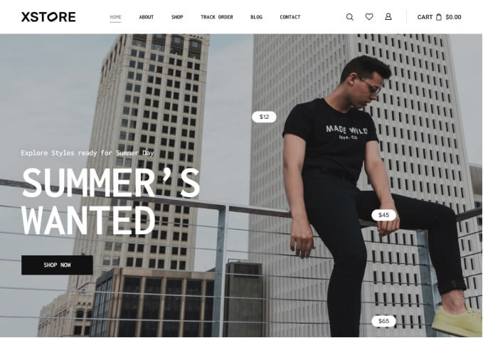
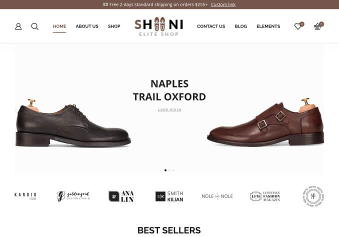
On mobile devices, the header menu items sometimes do not display correctly — the layout appears broken, with elements overlapping or being cut off (see attached screenshot).
This problem does not occur all the time but appears periodically, which makes it difficult to reproduce consistently. However, when it happens, it negatively affects the user experience as some menu items and buttons become partially visible or inaccessible.
Could you please investigate and provide a fix so that the header displays correctly on all mobile screen sizes at all times?
url website: https://absolute-teamsport.cy
If you need access to the site
Thank you in advance for your assistance.

