Hi there,
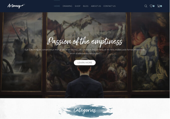
I would like to make my 1st image on homepage take up about 3/4 of the screen regardless of the device used (you can see this in action on noths.com).
The problem is that i need the image resize depending on device..
Desktop – Around 700px height
Tablet – Around 700 (landscape) / 500 (portrait)
Phone – Around 300px (landscape) / 500 (portrait)
1) Is there any way to make image resize in this way?
Also…
When using product slider on mobile there are no indicators that show visitor a swipe is available.
I tried setting “number of items on mobile” to 1.5 so they could see there were more products but this prevent swipe from working properly.
2) Is there a way to add visual swipe indicators (like you see on desktop hover)?