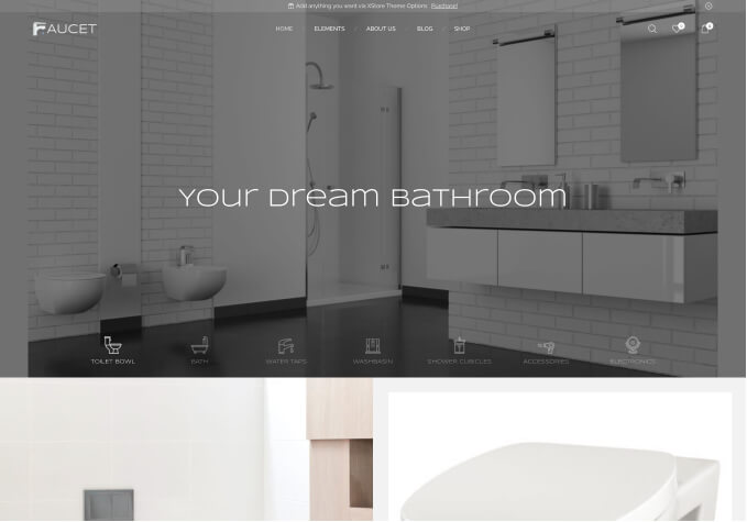
Hello,
On my homepage, I have one big picture following with image carousel of the menu.
It seems fine when viewed from the screen, but when it is seen from mobile devices, which means the the width of the page shrinks, the image carousel turns to be as big as the front picture of the page.
Can you offer me an advice how to shrink the image carousel proportional to the big front picture?
It might be better to take a look at my site on PC as well as on mobile device for your reference.
Thanks in advance.


