Image alignment for teaser box - by Olexi

This topic has 15 replies, 2 voices, and was last updated 9 years, 3 months ago ago by Eva Kemp

  • Avatar: Olexi
    Olexi
    Participant
    January 20, 2015 at 16:41

    hi,

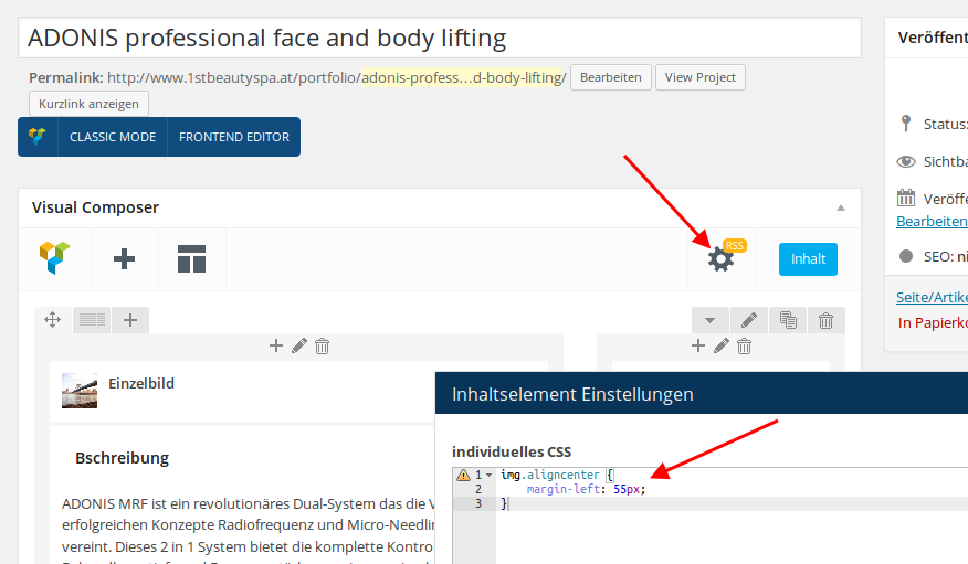
    i want ad an image to a teaser box inside of a portfolio post that should be aligned centered. but it shows always aligned left? i can not find a way to change the alignment?
    i tried then to ad it to the text instead of the upper image section. i changed the alignment to center but it also shows left? any idea how to get this done?

    many thanks,
    olexi

    14 Answers
    Avatar: Eva
    Eva Kemp
    Support staff
    January 20, 2015 at 17:25

    Hello,

    Could you please provide us with a link of a page and specify what image you want to align?

    Thank you.
    Regards,
    Eva Kemp.

    Avatar: Olexi
    Olexi
    Participant
    January 20, 2015 at 17:46

    you must login to the adminpanel to see the site … it is not life now. see logininfo in private content.

    this is the site i am talking about:
    http://www.1stbeautyspa.at/behandlungen/

    Please, contact administrator
    for this information.
    Avatar: Olexi
    Olexi
    Participant
    January 20, 2015 at 17:51

    sorry … this is the link to the page:
    http://www.1stbeautyspa.at/portfolio/adonis-professional-face-and-body-lifting/

    ther is a teaser box on the right side with the company logo.
    the headline says “preisliste” … the logo should be centered.

    best
    olexi

    Avatar: Eva
    Eva Kemp
    Support staff
    January 20, 2015 at 20:03

    Hello,

    I’ve added the following code in CSS block of Visual Composer editor:

    Please check the page now.

    Thank you.
    Regards,
    Eva Kemp.

    Avatar: Olexi
    Olexi
    Participant
    January 21, 2015 at 09:45

    hi eva,

    this does not work. when i change the size of my browser window or go to a pc with lower resolution the layout of the box breaks. any other solution?

    best
    olexi

    Avatar: Eva
    Eva Kemp
    Support staff
    January 21, 2015 at 10:13

    Hello,

    Please check your site on mobile device.
    When you resize browser window you must reload a page.

    Thank you.
    Regards,
    Eva Kemp.

    Avatar: Olexi
    Olexi
    Participant
    January 21, 2015 at 10:31

    it works on mobile, but resize does not work for me (safari, latest version, all updates installed)?

    best
    olexi

    Avatar: Eva
    Eva Kemp
    Support staff
    January 21, 2015 at 11:19

    Hello,

    Are you reloading a page when resizing a browser window?

    Regards,
    Eva Kemp.

    Avatar: Olexi
    Olexi
    Participant
    January 22, 2015 at 10:20

    it works on smartphone but not on the ipad and also not on pc/mac … when i resize the window to a size that the menu changes to the mobile menu on pc/mac … then the layout still breaks … even if i reload the page … same on ipad?

    best
    seb

    Avatar: Eva
    Eva Kemp
    Support staff
    January 22, 2015 at 10:31

    Hello,

    I’ve added this code in custom.css:

    @media (max-width: 979px) { img.aligncenter {
        margin-left: 0px !important;
    }
    }

    Please check the logo alignment now.

    Thank you.
    Regards,
    Eva Kemp.

    Avatar: Olexi
    Olexi
    Participant
    January 22, 2015 at 15:30

    hi eva,

    much better but still not perfect. it works on the iphone. on the ipad it works on portrait mode but not on landscape mode. same on ps/mac. when i make the browser window to a size that the menu changes to mobile but the logo in the header is on the left its not centered (like on the ipad landscape mode). when i make it smaller so the logo in the middle it is centered (like on the ipad portrait mode or on the iphone).

    best
    olexi

    ps: is it possible to change the windowdimension/resolution when it changes to the mobile menu? i would prefer the standard menu when i am on the ipad in landscape mode. is this possible use standard menu on the ipad landscape??

    Avatar: Eva
    Eva Kemp
    Support staff
    January 22, 2015 at 16:17

    Hello,

    You can try to edit the media query located in the responsive style sheet file wp-content/themes/royal/css/responsive.css at line 1005 and change @media only screen value.

    Thank you.
    Regards,
    Eva Kemp.

    Avatar: Olexi
    Olexi
    Participant
    January 27, 2015 at 12:38

    hi eva,

    this solution is not really perfect as it will get lost when i update. this is a very basic function and really should be working without editing in the themes css structure. any other solution, using an other element instead of the teaser box maybe? sorry for being pushy here 🙂

    best
    olexi

    Avatar: Eva
    Eva Kemp
    Support staff
    January 27, 2015 at 13:28

    Hello,

    Sorry, but there is no other solution except of editing the code in theme files.

    Please take our apologies for inconveniences.

    Regards,
    Eva Kemp.

  • Viewing 15 results - 1 through 15 (of 15 total)

You must be logged in to reply to this topic.Log in/Sign up

We're using our own and third-party cookies to improve your experience and our website. Keep on browsing to accept our cookie policy.