This topic has 6 replies, 2 voices, and was last updated 2 years, 11 months ago ago by Olga Barlow
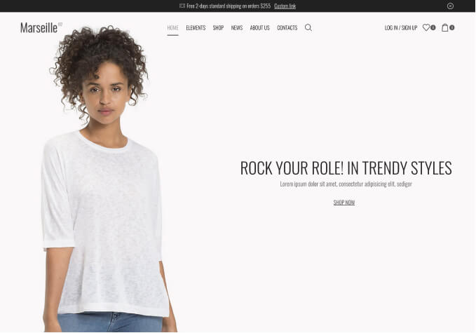
Hi there I want to create a main header video like this – https://www.dropbox.com/s/41rn9menjzbq90h/Screenshot%202021-05-13%20at%2014.14.13.png?dl=0
and then when on mobile look like this -https://www.dropbox.com/s/1seje7qtwbb2o3x/IMG_8851.PNG?dl=0
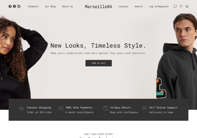
I seem to have been able to have done it on desktop here – http://www.allanmorrowstudios.com/pt
But when on mobile it looks like this – https://www.dropbox.com/s/yxa016qekcqx2tz/IMG_8850.PNG?dl=0
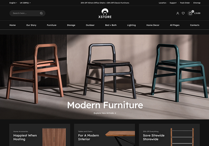
Here is how I have it set up – https://www.dropbox.com/s/3iacvm1i42b30k8/Screenshot%202021-05-13%20at%2014.13.45.png?dl=0
https://www.dropbox.com/s/wbl2qq7yogon4eb/Screenshot%202021-05-13%20at%2014.25.49.png?dl=0
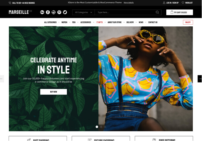
Could you please advise how I can achieve this? Here is another example of what I’m trying to get – https://www.reveal-sound.com/
Hello,
1) Browser does not show autoplay video for mobile devices to save battery law. So, upload also bg image for this row to show it as the video placeholder for the mobile devices.
2) You added empty space in first column and in second column https://prnt.sc/12venp0 In summ it’s 795px of the empty space for the mobile https://prnt.sc/12veoov Huge as for me.
Why don’t you use top/bottom paddings for the second column in vw or vh + small empty space element (50px for example) only for the second column that allows you to make it responsive depending on the device width or height?
Regards
1) Ok so how is this company doing it please? https://www.sonicacademy.com/
2) Ok So I have removed the spaces in the first column – https://www.dropbox.com/s/4pqm3ti79ly17oy/Screenshot%202021-05-14%20at%2012.07.43.png?dl=0
The site is now where I want it on desk top but its still way to low on mobile I want it to stop around the green mark on this image – https://www.dropbox.com/s/4mcq454gdwql6dq/IMG_8861.jpg?dl=0 as it staking up to much room on the mobile. How Do I do this without the desktop getting any slimmer than it already is on here – https://allanmorrowstudios.com/pt
Im not to sure if this is done with the padding you talk about? If so can you show me how I would do this please?
Thanks
Allan
Hello,
We are not developers of that site. You may contact the developers of that site and clarify that moment.
We know that WPBakery does not allow video autoplay for mobile devices because of https://developers.google.com/web/updates/2017/09/autoplay-policy-changes .
Try the Revolution slider as an alternative to create that section, they have additional options to avoid that https://www.sliderrevolution.com/faq/video-content-mobile/
Regards
Ok so as per 2) is there a way to do what I have asked without the video playing and the sizes being different on mobile and desktop? You mentioned about padding?
Thanks
Allan
Hello,
Provide us with WP Dashboard access and I’ll create you an example.
Regards
The issue related to '‘Header Video’' has been successfully resolved, and the topic is now closed for further responses