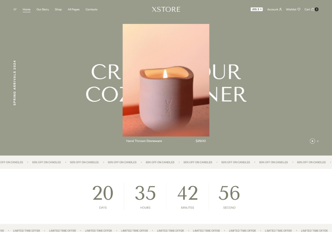
Hi simple issue in alignment top header as you can see in the first link there is a space between top header and main banner I dont need this is space I want design same like demo version
On desktop
http://prntscr.com/joaqln
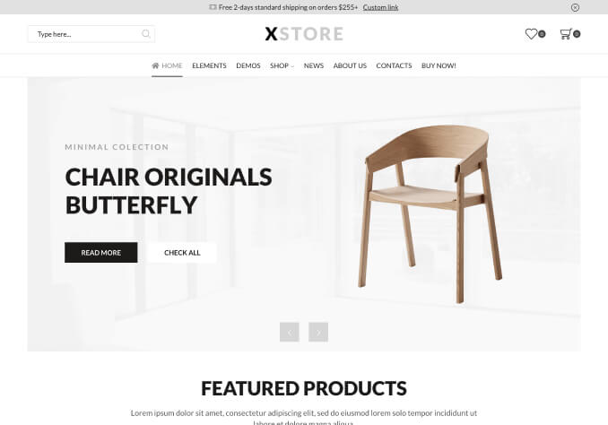
On mobile
the search not align with card and currency I spend too much time in column row setting for banners and header and I cant fix it
http://prntscr.com/joaqv9
TAHNKS