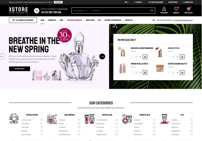
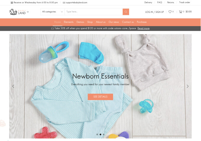
Full width image within category description

This topic has 8 replies, 3 voices, and was last updated 5 years ago ago by Rose Tyler

  • Avatar: strangehaven
    strangehaven
    Participant
    March 26, 2019 at 22:59

    Hi,
    I would like to create a full width header image within the category description so that I can replace the breadcrumb header – and therefore have individual headers for each category.

    I tried using html with a class and tried various css settings that will allow the image to be full width but there is still a margin on each side. Is there anyway to remove this margin? We would really like to be able to have custom headers for the various categories.

    testing it on page – http://thestrangehaven.com/product-category/crystals/

    If its possible, would you be able to point me in the right direction?
    thanks much

    Please, contact administrator
    for this information.
    7 Answers
    Avatar: Olga Barlow
    Olga Barlow
    Support staff
    March 27, 2019 at 13:36

    Hello,

    We have made changes in your child theme files (woocommerce/archive-product.php )http://prntscr.com/n3m5t1 Check the category page now. Is that what you want?

    Regards

    Avatar: strangehaven
    strangehaven
    Participant
    March 27, 2019 at 18:35

    Yes! thank you so much! You guys are great!

    Avatar: Olga Barlow
    Olga Barlow
    Support staff
    March 27, 2019 at 18:45

    You are welcome! I’m glad that my assistance was helpful for you.

    Regards

    Avatar: strangehaven
    strangehaven
    Participant
    April 12, 2019 at 00:13

    Also just wondering if this would be a possibility – Im looking to have cohesiveness with all of the pages on my site..

    Im really happy now that I have full width category images but I was wondering if it would be possible on mobile view to have the category image display larger like on my other pages

    example viewing the Blog – http://thestrangehaven.com/sh-blog/
    versus the product category – http://thestrangehaven.com/product-category/herbs/

    It looks great on desktop view but on mobile view the category header its too small.

    Hope you get what Im saying. Is it maybe possible to display a different image on mobile view that would fit the phone (more square, than a wide header)?

    I guess what im saying is making it more responsive – is this possible to do thru html?

    Please contact administrator
    for this information.
    Avatar: Olga Barlow
    Olga Barlow
    Support staff
    April 12, 2019 at 12:45

    Hello,

    We would recommend you:
    1) Use image as the background for the div and without text
    2) Add text inside div with the custom class as we did http://prntscr.com/nazrkh
    3) We have added custom code for the desktop and mobile versions to make the text size fix device, for example http://prntscr.com/nazsyt and http://prntscr.com/nazt70

    Check and let me know if it suits your needs.

    Regards

    Avatar: strangehaven
    strangehaven
    Participant
    April 16, 2019 at 01:37

    Thank you! That was perfect! You guys are awesome!

    Avatar: Rose Tyler
    Rose Tyler
    Support staff
    April 16, 2019 at 07:05

    Hello,

    You’re welcome!

    Regards

  • Viewing 8 results - 1 through 8 (of 8 total)

You must be logged in to reply to this topic.Log in/Sign up

We're using our own and third-party cookies to improve your experience and our website. Keep on browsing to accept our cookie policy.