Hi, I hope you can help.
Since upgrading to the new Theme 4.4, I’ve noticed that the Nav menu bar, main Product Title and The Add to Cart Buttons all use the Main font.
The problem is poor visibility/contrast.. that Titles are on White bg, Button Text is on Blue bg, Mobile Nav is on black bg and Nav is on Black BG using the same font style/color when perhaps there should be a few styles being used.
I have had to set the main font to grey because it seems to be at least visible on all backgrounds, however, it’s too light for a strong Title and if I darken it, it gets lost on the navigation backgrounds and the Add to Cart button.
I’ve looked at this code through the code inspector and cannot isolate any of these styles to make them suitable for their respective backgrounds, eg: main font seems to be used for all these situations.
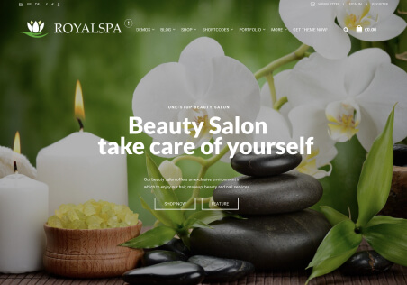
Also, can you see the green drop-down menu from the main nav, I can’t find where that is derived from, I would like to make it white.
am I missing something obvious here?
best regards
Ky

