Hello,
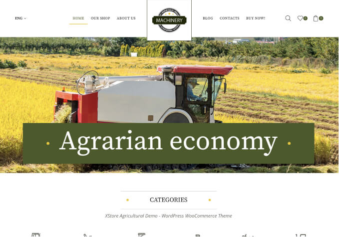
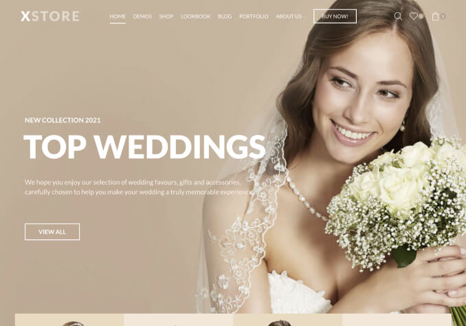
I have this Categories being displayed in the desktop version wich are ok:
https://prnt.sc/139kk9x
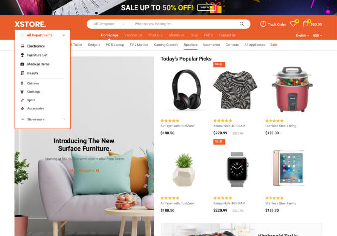
But in mobile they are apearing to large:
https://prnt.sc/139kov6
I just wanted them to apear in mobile side by side , instead of only one at a time…
Thank you!