Display Size - by Eugenio - on WordPress WooCommerce support

This topic has 2 replies, 2 voices, and was last updated 3 years, 12 months ago ago by Olga Barlow

  • Avatar: Eugenio
    Eugenio
    Participant
    April 23, 2020 at 15:40

    Hi,
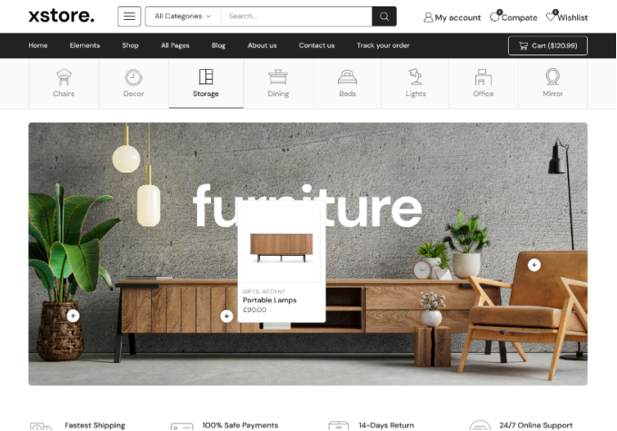
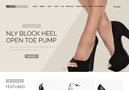
    is there a way to change breakend point? I think the second size of your theme has max-size set too small, near 1100px it seems; I’d like to set it higher to 1280px or 1366px. I’d like to use your four size in this way: Mobile, Tablet Portrait, Small Desktop, Large Desktop; For example (see images link 1 and link 2), for large desktop I set a block with 4 columns, while for small desktop I would set 2 columns, but it is quite near to tablet breakpoint.

    link 1 https://ibb.co/wYh38yz
    link 2 https://ibb.co/wNmbvYK

    thanks!

    1 Answer
    Avatar: Olga Barlow
    Olga Barlow
    Support staff
    April 23, 2020 at 19:09

    Hello,

    Columns responsive is related not to theme breakpoints but to WPBakery page builder http://prntscr.com/s4sv54 and we can’t change it. Contact WPBakery developers https://codecanyon.net/item/visual-composer-page-builder-for-wordpress/242431 but I’m not sure if they decide to change anything.

    Regards

  • Viewing 2 results - 1 through 2 (of 2 total)

You must be logged in to reply to this topic.Log in/Sign up

We're using our own and third-party cookies to improve your experience and our website. Keep on browsing to accept our cookie policy.