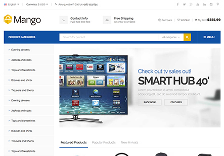
Instead of the 2 columns on the product page each being 1/2 of the page, I want the left column with the product image to be 1/3 width, and I need the right column with the Product description to be 2/3.
What css is needed to do this?
Thanks,
Rob
This topic has 15 replies, 3 voices, and was last updated 10 years, 11 months ago ago by Brian Johnson
Instead of the 2 columns on the product page each being 1/2 of the page, I want the left column with the product image to be 1/3 width, and I need the right column with the Product description to be 2/3.
What css is needed to do this?
Thanks,
Rob
Hello,
You need edit the file wp-content/themes/royal/woocommerce/content-single-product.php (lines 50 and 62) and change the code col-lg-6 col-md-6 to col-lg-3 col-md-3 on line 50 and the code col-lg-6 col-md-6 to col-lg-8 col-md-8 on line 62.
Thank you.
Regards,
Eva Kemp.
I am using your child theme, so I added wp-content/themes/royal/woocommerce/content-single-product.php to the child theme and make your suggested edits there, but it had not effect on the site.
I then removed it from the child theme and made the same edits to the parent theme’s wp-content/themes/royal/woocommerce/content-single-product.php, but it still had no effect on the site.
I’ve pasted the file below in private. Can you please let me know how to achieve my desired column widths on the single product page?
Thanks,
Rob
Hello,
Please provide us with FTP credentials.
Thank you.
Regards,
Eva Kemp.
Certainly
Domain: freeindeed.preachnet.com
My apologies. The ftp username is support@preachnet.com
Hello,
I’ve changed the column width for the product “4 Year Master Plan” in the file wp-content/themes/royal/woocommerce/content-single-product.php.
Please clear your browser cache and check.
Thank you.
Regards,
Eva Kemp.
It looks like the code you put in is the same as what I entered. Had I done something wrong, or was it just caching the previous page?
Hello,
The page seemed to be cached that’s why you didn’t see changes.
Is it fine now?
Regards,
Eva Kemp.
Yes it’s working now.
I’d like to also change the column widths on the List layout of the the shop page, which is at http://freeindeed.preachnet.com/sermons/
I’d like the left column with the product image to be 1/5, and the right column with production description text to be 4/5.
Which file and lines do I edit to achieve that?
Thanks,
Rob
Hello
Please add this code into the custom.css:
.post-type-archive-product .main-products-loop .text-center {width:70%!important}
.post-type-archive-product .main-products-loop .product-image-wrapper {width:19%!important}
@media only screen and (max-width: 768px){
.post-type-archive-product .main-products-loop .product-image-wrapper {width:100%!important}
.post-type-archive-product .main-products-loop .text-center {width:100%!important}}
With best regards
Brian Johnson
Brian, my apologies for the very late reply. I thought I had replied to this shortly after your last reply, but it looks like I did not.
So….your last code worked great. Please note, the site is now at preachnet.com/freeindeed, not at freeindeed.preachnet.com
I have another problem now though. While your code accomplished what I needed for the list view of the shop page at http://preachnet.com/freeindeed/sermons/, it has also made the image thumbnails on the grid view 1/5 of the width of the each image section, which makes them tiny.
So, what css can I use to ensure that the code you just gave me only applies to the list view, but not to the grid view?
Thanks,
Rob
Hello
You may use this one with .product-list selector instead of previous:
.post-type-archive-product .main-products-loop .product-list .text-center {width:70%!important}
.post-type-archive-product .main-products-loop .product-list .product-image-wrapper {width:19%!important}
@media only screen and (max-width: 768px){
.post-type-archive-product .main-products-loop .product-list .product-image-wrapper {width:100%!important}
.post-type-archive-product .main-products-loop .product-list .text-center {width:100%!important}}
With best regards
Brian Johnson
My apologies for the delayed reply. I’m not getting notifications of your replies to me email.
So are you saying the css should be the following?
.product-list .post-type-archive-product .main-products-loop .product-list .text-center {width:70%!important}
.product-list .post-type-archive-product .main-products-loop .product-list .product-image-wrapper {width:19%!important}
@media only screen and (max-width: 768px){
.product-list .post-type-archive-product .main-products-loop .product-list .product-image-wrapper {width:100%!important}
.product-list .post-type-archive-product .main-products-loop .product-list .text-center {width:100%!important}}
Yes. I have already added .product-list in my previous post. Please use this code:
.post-type-archive-product .main-products-loop .product-list .text-center {width:70%!important}
.post-type-archive-product .main-products-loop .product-list .product-image-wrapper {width:19%!important}
@media only screen and (max-width: 768px){
.post-type-archive-product .main-products-loop .product-list .product-image-wrapper {width:100%!important}
.post-type-archive-product .main-products-loop .product-list .text-center {width:100%!important}}
With best regards
Brian Johnson
You must be logged in to reply to this topic.Log in/Sign up

