= BUTTONS / ICONS / TEXT / THEME OPTIONS =

This topic has 34 replies, 3 voices, and was last updated 8 years, 7 months ago ago by Eva Kemp

  • Avatar: Libardo
    Libardo
    Participant
    August 11, 2015 at 13:37

    Good Day Support,

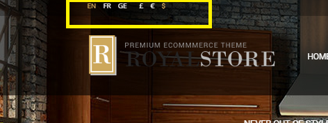
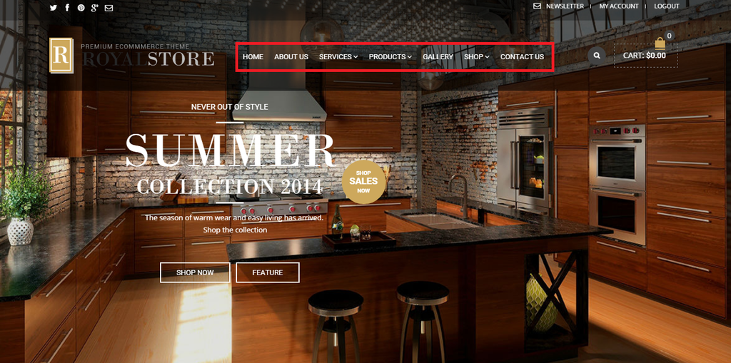
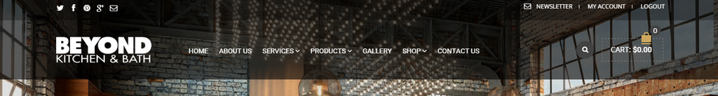
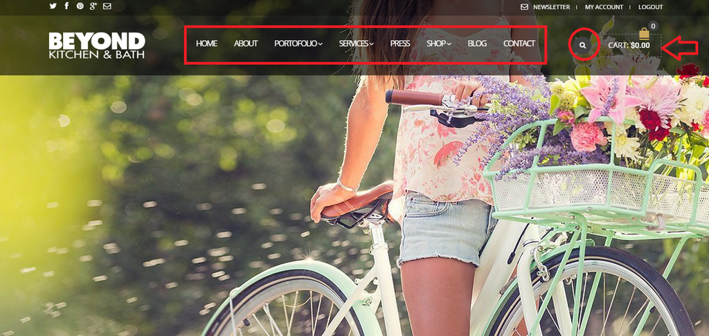
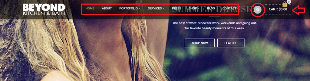
    Can you let me know where do a Disable the Language, Currency for the top bar of the theme?

    http://i1340.photobucket.com/albums/o728/LibardoBarreto/currency_zpsrqmrsnl7.png

    Also can you let me know where can I go to enable social media icons in the top bar? IS there something I have to include also in my Child Theme for whenever the theme updates it remember to always put or remove the icons for me?

    Let me know..

    33 Answers
    Avatar: Eva
    Eva Kemp
    Support staff
    August 11, 2015 at 15:05

    Hello,

    Go to wp-admin panel > Appearance > Widgets and add empty Text widget into “Left Side top bar area”.
    If you want to include social media icons in top bar then add Text widget to “Left Side top bar area” with content [share].

    Regards,
    Eva Kemp.

    Avatar: Libardo
    Libardo
    Participant
    August 12, 2015 at 15:18

    Thanks Eva.

    1.) How can I hide the Shop Icon / Search Icon / Social Media Icon only on Phone? For Tablet it can stay.

    http://i1340.photobucket.com/albums/o728/LibardoBarreto/Screenshot_2015-08-11-23-42-29_zpswibthscr.png

    2.) Can you make PICTURE A the same as PICTURE B? (See Private) P.S use as much as possible the Child Theme

    Please, contact administrator
    for this information.
    Avatar: Libardo
    Libardo
    Participant
    August 12, 2015 at 15:37

    Good Day,

    Please check above for the pending request. In addition I have the following as well:

    1.) How do a I slow done the counting to load the site? Meaning I would like the 100% to be at least 5 seconds available which customers can see that the site is loading meanwhile it is busy in the background pre-loading to be ready to show once entrance.

    http://i1340.photobucket.com/albums/o728/LibardoBarreto/100_zpsnqtolinj.png

    Avatar: Libardo
    Libardo
    Participant
    August 12, 2015 at 15:52

    Hi Eva,

    In addition to ticket #79633 and #79636 I want to ask the following:

    1.) How can I move the header menu to Up or Down or Right and also spacing between each? Is there a menu also I can go to to change the Fonts for this header menu in theme options?

    Please let me know..

    http://i1340.photobucket.com/albums/o728/LibardoBarreto/menu_zpsrmhxe6ie.png

    Avatar: Eva
    Eva Kemp
    Support staff
    August 12, 2015 at 17:22

    Hello,

    1. Please add this code in child style.css:

    @media (max-width: 480px) {
     .top-bar .languages-area, .navbar-right .navbar-right {
       display: none;
    }}

    2. I’ve added this code in child style.css for kiddowear.net site:

    .mobile-nav {
      text-align: left;
      margin-bottom: 0;
      padding-left: 0;
    }
    .mobile-nav li {
      display: block;
      position: relative;
    }
    .mobile-nav li.over > a {
      color: #FFF;
    }
    .mobile-nav li .open-child {
      float: right;
      font-size: 0;
      width: 40px;
      height: 40px;
      margin-top: 1px;
      display: block;
      cursor: pointer;
      position: relative;
      background-color: #151515;
      -webkit-transition: background-color .3s ease;
      -moz-transition: background-color .3s ease;
      -ms-transition: background-color .3s ease;
      -o-transition: background-color .3s ease;
      transition: background-color .3s ease;
    } 
    .mobile-nav li .open-child:hover {
      background-color: #0e0e0e;
    }
    .mobile-nav li .open-child:hover:after {
      background-position: bottom center;
    }
    .mobile-nav li .open-child:after {
      content: "";
      background-image: url(http://bkbcuracao.com/wp-content/themes/royal-child/wp-content/themes/royal/images/small-plus.png);
      background-position: bottom center;
      background-repeat: no-repeat;
      cursor: pointer;
      width: 19px;
      height: 19px;
      display: block;
      position: absolute;
      left: 10px;
      top: 10px;
      opacity: 0.5;
    }
    .mobile-nav li.over > .open-child:after {
      background-image: url('http://bkbcuracao.com/wp-content/themes/royal-child/wp-content/themes/royal/images/small-plus.png');
      background-position: top center;
      background-repeat: no-repeat;
    }
    .mobile-nav li.over > .open-child {
        transform: rotate(-180deg) !important;
    }
    .mobile-nav li .open-child::selection {
      background-color: transparent !important;
    }
    .mobile-nav li > a {
      color: #c7c7c7;
      display: block;
      line-height: 40px;
      padding: 0 10px 0 20px;
      font-size: 14px;
      font-family: Georgia;
      text-transform: uppercase;
      background: black;
      border-top: 1px solid #222222 !important;
    } 
    .mobile-nav li > a:hover {
      background-color: #989898;
      text-decoration: none;
      color: #222;
      -webkit-transition: background-color .3s ease;
      -moz-transition: background-color .3s ease;
      -ms-transition: background-color .3s ease;
      -o-transition: background-color .3s ease;
      transition: background-color .3s ease;
    }
    .mobile-nav > li > ul {
      border-top: 0 !important;
      padding-left: 0;
      margin-bottom: 0;
    }
    .mobile-nav li > ul {
     background-color: black;
    }
    
    .mobile-nav .links  {
      border-top: none;
    }
    
    .mobile-nav > li ul {
      display: none;
      padding: 0;
      margin: 0;
    }
    .mobile-nav > li > ul li {
      display: block;
      position: relative;
      background: black;
    }
    .mobile-nav > li > ul > li a {
      padding-left: 20px;
      margin-left: 20px;
      text-transform: none;
      font-size: 12px;
      font-family: "Open Sans", Arial;
      display: block;
      background-color: #151515;
    }
    .mobile-nav > li > ul > li a:before {
      font-family: "FontAwesome";
      font-weight: normal;
      font-style: normal;
      text-decoration: inherit;
      content: "\f105";
      -webkit-font-smoothing: antialiased;
      float: left;
      line-height: 40px;
      font-size: 16px;
      margin-right: 10px;
      -webkit-transition: all 0.2s ease-in-out;
      -moz-transition: all 0.2s ease-in-out;
      -ms-transition: all 0.2s ease-in-out;
      -o-transition: all 0.2s ease-in-out;
      transition: all 0.2s ease-in-out;
    }
    .mobile-nav > li > ul > li li a {
      padding-left: 15px;
      background-color: #151515;
      margin-left: 40px;
    }
    .mobile-nav > li > ul > li li li a {
      padding-left: 30px;
      background-color: #151515;
      margin-left: 40px;
    }
    .mobile-nav > li > ul > li li li  li a {
      padding-left: 40px;
      margin-left: 45px;
    }
    
    .mobile-nav-heading.close-mobile-nav {
        font-size: 18px !important;
        background-color: black !important;
        font-weight: bold !important;
    }
    .mobile-nav {
     background-color: black !important;
    }
    
    .mobile-nav li .open-child {
     background-color: black !important;
    }.st-menu-open .mobile-menu-block > .mobile-menu-block.st-menu {    background-color: black !important;}

    Please note I’ve written the path to your second site for “plus” icons – http://bkbcuracao.com/wp-content/themes/royal-child/wp-content/themes/royal/images/small-plus.png because you didn’t modify images for kiddowear.net.

    3. You can change menu font in Theme Options > Typography > Menu Font.
    To move menu upper use this code in child style.css:

    .menu {
      margin-top: -40px;
    }

    To move it to the right use this code:

    .menu {
      float: right;
    }

    Regards,
    Eva Kemp.

    Avatar: Libardo
    Libardo
    Participant
    August 12, 2015 at 17:28

    Hi Eva,

    Thanks. Can you also check for me #79636? This is regarding to slow the counter at the entrance of the site ..

    In addition can you let me know which code to place in the child theme of kiddowear site for when scrolling down with the menu it keeps showing the black transparent header style? This was the same issue which we had initially of the bkbcuracao site.

    http://i1340.photobucket.com/albums/o728/LibardoBarreto/scrolling_zpsh37b1pdb.png

    Avatar: Eva
    Eva Kemp
    Support staff
    August 12, 2015 at 17:45

    Hello,

    I’ve added this code in child style.css:

    .fixed-header-area {
    background-color: rgba(0, 0, 0, 0.6);
    border-bottom: none;
    }
    
    .menu > li > a, .shop-text {
      color: white;
    }

    Please check fixed header now.

    Sorry, but there is no option to slow the counter.

    Regards,
    Eva Kemp.

    Avatar: Libardo
    Libardo
    Participant
    August 12, 2015 at 19:35

    Ho Eva,

    Thanks. Looking good.

    Can you let me know which code can be used to move the logo in the header menu to right/left/bottom/up on mobile/tablet and desktop?

    Avatar: Libardo
    Libardo
    Participant
    August 12, 2015 at 21:22

    Hi Eva,

    I’ve use this code but is floating to much to right .. is there a way to center the menus automatically?

    .menu {
    float: right;
    }

    Also can you provide a code for spacing between each of the menus? I also notice when scrolling down the website the menus get scrambled for the kiddowear site. Can you check?

    Avatar: Libardo
    Libardo
    Participant
    August 12, 2015 at 21:31

    Hi Eva,

    With respect to the same ticket #79734.

    Can you let me know which Fonts to use for our website as this website ( http://hnd.detheme.com/fullwidth2/ )

    Avatar: Jack Richardson
    Jack Richardson
    Support staff
    August 13, 2015 at 07:54

    Hello,

    That site uses fonts: ‘Open Sans’, Montserrat, lora.
    Use this code for menu:

    .menu {
      float: right;
      margin-right: 10%;
    }
    .fixed-header-area .menu {
      float: right;
      margin-right: 10%;
      width: 100%;
    }
    .menu > li {
      padding-left: 10px;
    }

    Best regards,
    Jack Richardson.

    Avatar: Libardo
    Libardo
    Participant
    August 13, 2015 at 20:18

    Hi Jack,

    It would be hard for me to understand you if you have not provide the description for each of the CSS what it does?? I know ask a couple of questions but to which is it related to?

    I also include these codes into my style.css file but dont see difference neither on Desktop or Mobile.

    So please address accordingly.
    Thank you.

    Avatar: Libardo
    Libardo
    Participant
    August 13, 2015 at 20:33

    So use these two (2) codes together, but still wasnt able to center all the text as we wanted to be. The spacing between each word is good but we would like to move all the menus a bit more to right. Please provide the correct code.

    .menu {
    float: right;
    margin-right: 10%;
    }

    .menu > li {
    padding-left: 10px;
    }

    I also use this code:

    .fixed-header-area .menu {
    float: right;
    margin-right: 10%;
    width: 100%;
    }

    And it was not good. Kindly please check for yourself to be honest.. Can you fix the fixed header menu to be the same as the one when you open on the website?

    Can you also let me know which code can be used to move the logo in the header menu right/left/bottom/up on mobile/tablet and desktop? The codes provided does not move the logo or forgot to include this one code.

    Avatar: Eva
    Eva Kemp
    Support staff
    August 14, 2015 at 09:49

    Hello,

    I’ve edited the code in child style.css:

    .menu {  float: right;  margin-right: 6%;}
    .fixed-header-area .menu {  float: right;  margin-right: 6%;  width: 100%;}
    .fixed-header-area .collapse {
       width: 60%;
    }
    .fixed-header-area .header-logo {
        width: 25%;
    }

    Please check menu now.

    We don’t recommend to move logo on mobile because header will be corrupted.
    To move logo on tablet use this code in child style.css:

    @media (max-width: 992px) {.header-logo {
        left: 20%;
        margin-top: 10px;
    }}

    For desktop use this code:

    .header-logo img {
        margin-left: 50px;
    }

    Regards,
    Eva Kemp.

    Avatar: Libardo
    Libardo
    Participant
    August 14, 2015 at 22:02

    Hi Eva,

    I have a couple of questions:

    1.) If you look at the Header menu font it does not look the same when I scroll down please see below both screen shots:

    http://i1340.photobucket.com/albums/o728/LibardoBarreto/23_zps0yeg8ajk.png

    http://i1340.photobucket.com/albums/o728/LibardoBarreto/545_zpsesldhjj5.png

    2.) When I scroll down the ” Search Icon ” shows a lighter grey then the one I see on the header menu without scrolling down. Can you put the fixed header ” Search Icon ” darker?

    http://i1340.photobucket.com/albums/o728/LibardoBarreto/545_zpsesldhjj5.png

    3.) How can I change for both Fixed and standard Header the square around the shopping cart? I dont want it to be with Dots in between. I just want it to be a complete square.

    4.) When I hover my mouse over the Fixed and the standard header menus I see sub menus. How do I change the Fonts Type, Font size etc.. of these?

    5.) When the website entrance I see “Newsletter / My Account / Log Out” text which Fonts there are using and also how to change the fonts type, fonts size?

    Avatar: Eva
    Eva Kemp
    Support staff
    August 17, 2015 at 09:22

    Hello,

    1. I’ve added this code in child style.css:

    .fixed-header-area .menu {  float: left;  margin-right: 6%;  width: 100%;}
    .fixed-header-area .collapse, .menu-main-container {
        width: 750px;
    }
    .fixed-header-area .header-logo {
        width: 18%;
    }
    
    .menu > li > a {
        font-family: Open Sans;
        font-size: 15px;
    }

    2. I’ve added this code:

    .fixed-header-area .et-search-trigger.search-dropdown .fa-search {
        background-color: #424242;
    }

    3. This code has been added into child style.css:

    .shopping-cart-widget, .header-type-3.slider-overlap .header .shopping-cart-widget {
        border: 1px solid #DFDFDF;
    }

    4. Add this code in child style.css:

    .menu .nav-sublist-dropdown ul > li > a {
        font-size: 12px;
        color: #767676;
        font-family: Open Sans;
    }

    Write your values.

    5. They are using these values:

    .top-bar a {
        font-size: 11px;
        font-family: Open Sans;
    }

    Change them to your needs.

    Regards,
    Eva Kemp.

    Avatar: Libardo
    Libardo
    Participant
    August 21, 2015 at 02:34

    Hi Eva,

    I’ve included a code I received a while ago for Testimonials widget but seems not to work as should. I use this code:

    blockquote.testimonials-text:before {
    display: none !important;
    }

    blockquote.testimonials-text:after {
    display: none !important;

    }

    But still on the following page (see private) it is not showing as the one of BKB (see private).

    Please, contact administrator
    for this information.
    Avatar: Eva
    Eva Kemp
    Support staff
    August 21, 2015 at 08:12

    Hello,

    Please add this code in child style.css file:

    blockquote.testimonials-text {
        background-color: transparent;
        border: none;
    }
    blockquote.testimonials-text::before, .testimonial-info .testimonial-author {
        display: none;
    }

    We can’t do this because you restricted access to wp-admin panel. We’re getting “Forbidden” error.

    Regards,
    Eva Kemp.

    Avatar: Libardo
    Libardo
    Participant
    August 21, 2015 at 16:29

    Hi Eva,

    I tried the new code provided but still showing the same. Can you please check once more? (See also private)

    Please, contact administrator
    for this information.
  • 1 2
    Viewing 20 results - 1 through 20 (of 34 total)

You must be logged in to reply to this topic.Log in/Sign up

We're using our own and third-party cookies to improve your experience and our website. Keep on browsing to accept our cookie policy.