Bug – Mobile Header Version in Desktop

This topic has 2 replies, 2 voices, and was last updated 2 years, 4 months ago ago by Rose Tyler

  • Avatar: avecesar
    avecesar
    Participant
    December 4, 2021 at 02:53

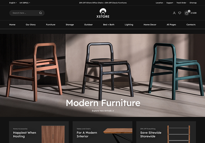
    When I change the Header settings in Desktop, the Desktop version of the Header appears on the cell phone and when I change the Mobile Header, the mobile version of the Desktop appears.
    You can check it now, I’ve cleared the cache.

    Is it also possible to put the product images all at the same height? (proportional)

    Please, contact administrator
    for this information.
    1 Answer
    Avatar: Rose Tyler
    Rose Tyler
    Support staff
    December 4, 2021 at 09:57

    Hello,

    Thanks for using our theme and for contacting us.

    Go to Theme Options > General > disable mobile optimization. Clear all cache (plugin, browser) and check then.

    About image size read here – https://xstore.helpscoutdocs.com/article/89-product-images Regenerate thumbnails using plugin mentioned in our docs to apply settings. It is recommended to use a graphics editor and prepare product images (make them the same size) before uploading images to your media gallery.

    Regards

  • Viewing 2 results - 1 through 2 (of 2 total)

The issue related to '‘Bug – Mobile Header Version in Desktop’' has been successfully resolved, and the topic is now closed for further responses

We're using our own and third-party cookies to improve your experience and our website. Keep on browsing to accept our cookie policy.