Hi
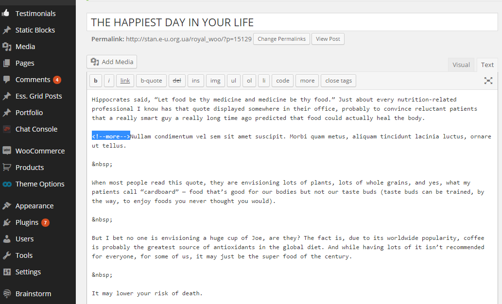
How can we make this layout neater? http://prntscr.com/6fbefr
Ideally, I would like to have the image aligned left and the rest (title, excerpt and button aligned right, similar to this blog: http://www.vivadigital.net/sunshine-coast-web-design-news/)
Thanks