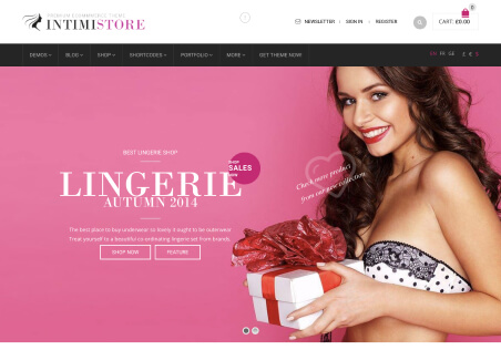
Design a Bold Header Color for Your WooCommerce Theme - WordPress
When designing a WordPress WooCommerce Theme, one of the most important features to consider is the header color. The color of the header will have a huge impact on the first impression your website makes and color psychology can be used to create a desired emotion.
Using colors to draw attention to your header and make it stand out from the rest of your website is essential for an aesthetically pleasing and user-friendly experience. Choosing a header color that is harmonious with the rest of the site will create a cohesive and inviting feel to your online store.
Different colors can evoke different emotions and feelings, so it is important to choose a color that reflects the experiences you want your customers to have. Bright and vibrant hues such as shades of red or yellow can be used to signal creativity and passion while pastel colors or darker hues such as black can be used to evoke confidence and professionalism.
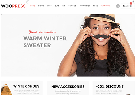
You should also consider the colors used in your branding and logo when designing a header color. If your logo and branding feature warm colors, then a warmer header color would work well, and the same is true for cool colors. You should also think about the overall theme of your website and how the header color will fit in with the rest of your design.
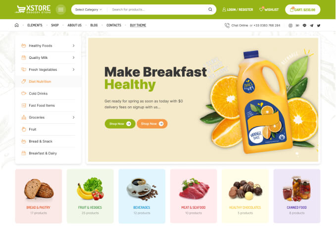
When designing a header color, it is important to consider the psychological effects of color, the colors used in your branding, and the overall theme of your website. Ultimately, the goal should be to choose a color that is harmonious and reflective of the desired emotions and experiences you want your customers to have. A good header color should also help draw attention to your header and make your website stand out from the rest.