Template Banner not optimized for Mobile View

This topic has 11 replies, 3 voices, and was last updated 10 years, 6 months ago ago by Eva Kemp

  • Avatar: vulcansg
    vulcansg
    Participant
    May 27, 2015 at 10:52

    Hi guys!

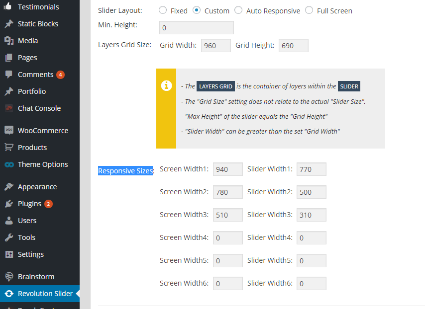
    I have noticed a problem on the mobile view for the legenda template that I’m currently using. It seems that the banner is not optimized for mobile.

    How do I?:

    1) Adjust the appearance (size of the banner) on mobile view?

    2) Remove or adjust boxes sizes ((1)The Trend setter & (2) Free Registered Shipping) as seen on my website http://www.vulcan.com.sg

    3) Adjust between carousell (Featured products and Latest products)

    4) Lastly, how do I check my theme and woo commerce version?

    Thank you in advance for your assistance 🙂

    10 Answers
    Avatar: Eva
    Eva Kemp
    Participant
    May 27, 2015 at 12:08

    Hello,

    1. You can change banner size using this code in custom.css file:

    @media (max-width: 480px) { .banner.hover-zoom img {
      height: 150px;
    }}

    2. To remove banners use this code in custom.css file:

    @media (max-width: 480px) { .banner {
     display: none;
    }}

    3. To remove space between 2 products sliders use this code:

    @media (max-width: 480px) { .vc_custom_1398413457173 {
        margin-bottom: 0px !important;
    }
    .slider-container, .items-slider {
     margin-bottom: -50px !important;
    }}

    4. You can check theme version in Appearance > Themes > open theme details. To see Woocommerce version go to Plugins section in wp-admin panel and find Woocommerce plugin there.

    Regards,
    Eva Kemp.

    Avatar: vulcansg
    vulcansg
    Participant
    May 28, 2015 at 13:21

    Hi Eva,

    Thanks for the quick reply and the resource for changing and remove the banner. But my concern is still the button (All features & Categories) within the banner. How do I remove the buttons for mobile view!

    Thanks,
    Roz

    Avatar: Eva
    Eva Kemp
    Participant
    May 28, 2015 at 15:38

    Hello,

    Are you talking about buttons “All features & Categories” in the slider?
    If so you can hide them with this code in custom.css file:

    @media (max-width: 480px) {.tp-caption.subtitle_seagreen2, .tp-caption.black, .black, .tp-caption.text_white {
      display: none !important;
    }}

    Regards,
    Eva Kemp.

    Avatar: vulcansg
    vulcansg
    Participant
    June 1, 2015 at 05:05

    Hi Eva,

    Thanks but the code (for #66695) won’t work 🙁

    Also, How do I change the slider size on Mobile view?

    Hear from you soon!

    Cheers,
    Roz

    Avatar: stan
    Stan Russell
    Participant
    June 1, 2015 at 07:57

    Hello,

    please provide us with admin credentials for your site in private content.
    You can set Revolution slider size for any mobile resolution in Dashboard > Revolution Slider > Main slider settings > set Slider Layout to ‘Custom’ and specify Responsive Sizes as you want:

    Regards,
    Stan Russell.

    Avatar: vulcansg
    vulcansg
    Participant
    June 1, 2015 at 11:11

    Hi Stan,

    Please see private content.

    Thank you!

    Please, contact administrator
    for this information.
    Avatar: vulcansg
    vulcansg
    Participant
    June 1, 2015 at 11:15

    Hi,

    I have followed the steps as instructed but I can only change the width and not the height of the slider.

    Regards,
    Roz

    Avatar: Eva
    Eva Kemp
    Participant
    June 1, 2015 at 13:41

    Hello,

    The previous code didn’t work because you forgot to add } in the code before. I’ve added it and the buttons aren’t shown now.
    Please check.
    To change slider height on mobiles add this code in custom.css file:

    @media (max-width: 480px) {.rev_slider_wrapper, .fullwidthbanner-container .fullwidthabanner {
     height: 150px !important;
    }}

    Regards,
    Eva Kemp.

    Avatar: vulcansg
    vulcansg
    Participant
    June 3, 2015 at 07:19

    Hi Eva,

    Thank you! It worked 🙂

    Cheers,
    Roz

    Avatar: Eva
    Eva Kemp
    Participant
    June 3, 2015 at 11:54

    Hello,

    You’re welcome.

    Regards,
    Eva Kemp.

  • Viewing 11 results - 1 through 11 (of 11 total)

The issue related to '‘Template Banner not optimized for Mobile View’' has been successfully resolved, and the topic is now closed for further responses

We're using our own and third-party cookies to improve your experience and our website. Keep on browsing to accept our cookie policy.