Mobile Navigation - by OPTBRAS - on WordPress WooCommerce support

This topic has 4 replies, 3 voices, and was last updated 10 years, 7 months ago ago by Robert Hall

  • Avatar: OPTBRAS
    OPTBRAS
    Participant
    May 20, 2015 at 09:03

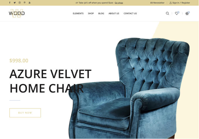
    I can see that the navigation on mobile device is not the same as it is on the website. On the website the navigation is cream background with black writing but on the mobile its black background and grey writing, so you cant read it very well.

    Can you tell me how i can change this?

    Is it CSS, if so which line? If its not CSS which file do i change?

    many thanks

    Please, contact administrator
    for this information.
    3 Answers
    Avatar: Eva
    Eva Kemp
    Participant
    May 20, 2015 at 10:48

    Hello,

    Add this code in custom.css file:

    @media (max-width: 767px) { .mobile-nav-shown .mobile-nav, .et-mobile-menu li > a, .side-block .close-block, .et-mobile-menu li .open-child {
       background-color: rgb(248, 237, 221) !important;
    } 
    .et-mobile-menu li > a {
    color: black !important;
    }}

    Regards,
    Eva Kemp.

    Avatar: OPTBRAS
    OPTBRAS
    Participant
    May 20, 2015 at 14:11

    Works, many thanks

    Avatar: Robert Hall
    Robert Hall
    Participant
    May 20, 2015 at 14:16

    Hello,

    You’re welcome!

    Regards,
    Robert Hall.

  • Viewing 4 results - 1 through 4 (of 4 total)

The issue related to '‘Mobile Navigation’' has been successfully resolved, and the topic is now closed for further responses

We're using our own and third-party cookies to improve your experience and our website. Keep on browsing to accept our cookie policy.