Hi XStore Support Team,
I am using a new website with the XStore theme. I noticed a few mobile-specific issues that need adjustments:
Mobile Header Layout:
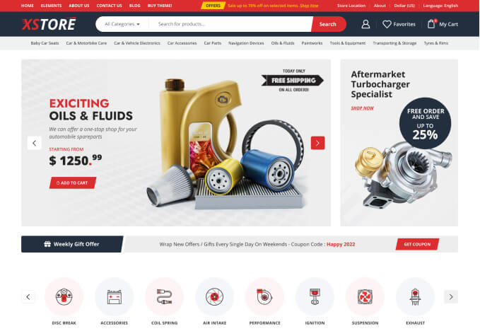
Currently, the mobile header shows the menu, brand logo, and cart in two separate lines.
I want all three elements (menu button, brand logo, and cart) to appear in one single line, just like a proper responsive header.
Please adjust the layout so that it looks neat and aligned in mobile view.
Carousel Container Issue:
The top “carousel everything” container disappears while scrolling on mobile.
On desktop, it stays visible as expected, but on mobile, it gets hidden during scroll.
I want this container to remain visible while scrolling on mobile, similar to how the header behaves.
I’ve attached screenshots for reference showing the two-line header and the missing carousel issue. Please help adjust the mobile responsiveness for both header and carousel.
Thanks in advance for your support.