Hello,
I need help with a couple of issues on my website’s mobile view:
1. Blog Layout:
I want the blog layout on mobile to resemble this example (see attached Screenshot 1). The sidebar allows readers to swipe, which I like. Currently on mobile (see Screenshot 2), the other group of posts is laid out one by one, so viewers have to scroll down, which takes up too much space. I would like it to look like Screenshot 1. Please also check how it appears on desktop for reference.
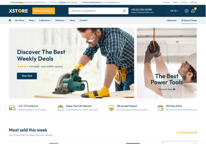
2. Products Section:
On mobile, the product display is not centered, and the product names sometimes appear off to the side. Could you advise how to fix this so it displays neatly and consistently across devices?
3. Navigation Issue: In my previous message, I asked for help with navigation that hasn’t been resolved yet. I want the site to go directly from the blog to the “Peak Productivity” section. Can you guide me on how to do this?
Thank you for your help!