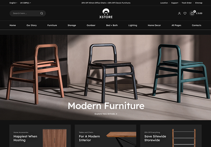
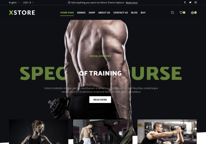
2 Headers in both Mobile and desktop view

This topic has 16 replies, 3 voices, and was last updated 4 years, 3 months ago ago by Rose Tyler

  • Avatar: MJ
    MJ
    Participant
    August 18, 2021 at 03:37

    Hi,
    1. i have an issue with header. Mobile and desktop mode show both menu types https://prnt.sc/1q9hya2
    Note: this happened 2 times when I added CSS for my custom menu (what you provided before). I removed them along with the menu and the issue is not resolved.
    2. i also want to hide BG color for “Account” in mobile mode.
    3. can i change the tab style https://prnt.sc/1q9tsu4 to button like https://prnt.sc/1q9tv53 ?

    Thanks

    Please, contact administrator
    for this information.
    15 Answers
    Avatar: Rose Tyler
    Rose Tyler
    Support staff
    August 18, 2021 at 07:53

    Hello,

    Clear cache and check now.

    Regards

    Avatar: MJ
    MJ
    Participant
    August 18, 2021 at 08:24

    Thanks yes its working.
    can you explain what you did?
    and
    3. can i change the tab style https://prnt.sc/1q9tsu4 to button like https://prnt.sc/1q9tv53 ?

    Avatar: Rose Tyler
    Rose Tyler
    Support staff
    August 18, 2021 at 08:40

    I’ve edited your custom CSS code, there was unclosed { in Theme Options > Theme custom CSS > Global custom CSS.
    3/ Change this code of Tabs – https://gyazo.com/14e170faa78072ad3faca760b97be8f4
    to

    /* tabs */
    .et-tab-content {
        border: 3px solid #E95D2A;
    }
    .et-tabs-wrapper .tabs-nav {
        border-bottom: none;
        padding-bottom: 0px;
    }
    .tabs .tab-title {
        padding: 15px 62px 15px 62px !important;
        font-size: 16px !important;
        font-weight: 500;
        text-transform: none !important;
        background: #F0F0F0;
        color: #999;
    }
    .tabs .tab-title:hover, .tabs .tab-title:focus {
        color: #e95d2a;
    }
    .et-tabs-wrapper .tabs .tab-title.opened, 
    .et-tabs-wrapper .tabs .tab-title:hover {
        color: #fff!important;
        background-color: var(--et_active-color);
    }
    .et-tabs-wrapper .tabs-nav li.et-opened:before,
    .et-tabs-wrapper .tabs .accordion-title.opened:before{
        display: none;
    }
    .et-tabs-wrapper .tabs-nav li.et-opened:before {
        display: none;
    }
    .et-tabs-wrapper .tabs-nav {
        padding-bottom: 0px;
    }

    Regards

    Avatar: MJ
    MJ
    Participant
    August 18, 2021 at 08:54

    It works, Thanks
    just that if possible to give some space between the buttons and black border would be perfect.
    i want them look separated

    Avatar: Olga Barlow
    Olga Barlow
    Participant
    August 18, 2021 at 16:55

    Hello,

    Use below code to add space

    .et-tabs-wrapper .tabs-nav li {
        margin: 0 10px;
    }

    Change color to what you need by editing the border https://prnt.sc/1qagtfv

    Regards

    Avatar: MJ
    MJ
    Participant
    August 19, 2021 at 03:05

    Hi
    Thanks I did some changes and get this https://prnt.sc/1qba5l4
    the margin did not work. what i wnat to achieve is something similar to this:
    https://prnt.sc/1qba78s fixed size tabs in 2 lines. Now all of them squeezed in one line with different sizes.
    appreciate your help.

    Avatar: Olga Barlow
    Olga Barlow
    Participant
    August 19, 2021 at 12:49

    Hello,

    I replaced

    .et-tabs-wrapper .tabs-nav li {
        border-color: #999 !important;
        border-style: solid;
        margin: 10px;
        border-width: 1px;
    }

    with

    .page-wrapper .et-tabs-wrapper .tabs-nav li {
        border-color: #999 !important;
        border-style: solid;
        margin: 10px;
        border-width: 1px;
        width: 150px;
        max-width: 150px;
    }

    Check now.

    Regards

    Avatar: MJ
    MJ
    Participant
    August 19, 2021 at 12:55

    You are awesome, thanks
    One tiny think, can I remove that blue triangle as well?
    And can I move the code to global css so that applies to mobile n tablet? Now it’s text in mobile.

    Avatar: Olga Barlow
    Olga Barlow
    Participant
    August 19, 2021 at 13:41

    Hello,

    You are welcome.
    Code replaced with this one

    /* tabs */
    
    .et-tabs-wrapper .tabs-nav {
        border-bottom: none;
        padding-bottom: 0px;
    }
    .page-wrapper .et-tabs-wrapper .tabs-nav li {
        margin: 10px;
        width: 150px;
        max-width: 150px;
    }
    .page-wrapper .et-tabs-wrapper .accordion-title {
        margin: 10px 0;
    }
    .page-wrapper .et-tabs-wrapper .tabs-nav li, .page-wrapper .et-tabs-wrapper .accordion-title {
        border: 1px solid #999 !important;
        background: #F0F0F0;
        padding: 0 !important;
    }
    .tabs .tab-title, .page-wrapper .et-tabs-wrapper .accordion-title span{
        padding: 10px 10px 10px 10px !important;
        font-size: 16px !important;
        font-weight: 500;
        text-transform: none !important;
        color: #999;
    }
    .tabs .tab-title:hover, .tabs .tab-title:focus, .page-wrapper .et-tabs-wrapper {
        color: #e95d2a;
    }
    .et-tabs-wrapper .tabs .tab-title.opened, 
    .et-tabs-wrapper .tabs .tab-title:hover,
    .page-wrapper .et-tabs-wrapper accordion-title:hover span, 
    .page-wrapper .et-tabs-wrapper .accordion-title.opened, 
    .page-wrapper .et-tabs-wrapper .accordion-title.opened span  {
        color: #fff!important;
        background-color: var(--et_active-color);
    }
    .template-content .et-tabs-wrapper .tabs-nav li.et-opened:before,
    .template-content .et-tabs-wrapper .tabs .accordion-title.opened:before,
    .template-content .et-tabs-wrapper .tabs-nav li.et-opened:before {
        display: none;
    }
    .et-tabs-wrapper .tabs-nav {
        padding-bottom: 0px;
    }

    Regards

    Avatar: MJ
    MJ
    Participant
    August 19, 2021 at 14:07

    This is perfect in desktop, in mobile, buttons take whole screen. Can it be arranges it in a way keep the same style as desktop? push the content of the tabs to open under all buttons exactly like how it behaves in desktop.

    Avatar: MJ
    MJ
    Participant
    August 20, 2021 at 03:57

    1. this is how it looks in mobile https://prnt.sc/1qcuazw
    want to keep this format in mobile https://prnt.sc/1qcubif
    2. my search window does not open for some reason.
    before click (https://prnt.sc/1qcucq0) and after click on search (https://prnt.sc/1qcuc80)
    the page gets dim but nothing opens.
    3. i want to create multiple secondary menu for each page (main menu items). i need some guideline.
    Thanks

    Avatar: MJ
    MJ
    Participant
    August 23, 2021 at 10:23

    please dont forget this

    Avatar: Olga Barlow
    Olga Barlow
    Participant
    August 23, 2021 at 16:48

    Hello,

    1) Tabs are like accordion on the mobile, so there is no way to show titles one by one on mobile.
    2) Check now.
    3) Create a separate topic for the different questions, please, to avoid misunderstanding.
    What do you mean by “create multiple secondary menu for each page”? Explain in more detail in new topic, please.

    Regards

    Avatar: MJ
    MJ
    Participant
    August 24, 2021 at 02:00

    Thanks for #1&2.
    please explain what was wrong with search and how did you fix it.
    and for #3 please see #299691.
    Thanks

    Avatar: Rose Tyler
    Rose Tyler
    Support staff
    August 25, 2021 at 15:35

    Hello,

    Sorry, but I can’t explain, Olga is on vacation now and during the next 2 weeks.

    Regards

  • Viewing 16 results - 1 through 16 (of 16 total)

The issue related to '‘2 Headers in both Mobile and desktop view’' has been successfully resolved, and the topic is now closed for further responses

We're using our own and third-party cookies to improve your experience and our website. Keep on browsing to accept our cookie policy.