Slider Revolution - by Dhawal Saxena - on WordPress WooCommerce support

This topic has 2 replies, 2 voices, and was last updated 5 years, 1 months ago ago by Olga Barlow

  • Avatar: Dhawal Saxena
    Dhawal Saxena
    Participant
    November 12, 2020 at 08:44

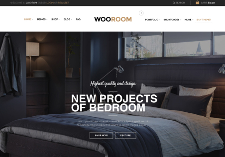
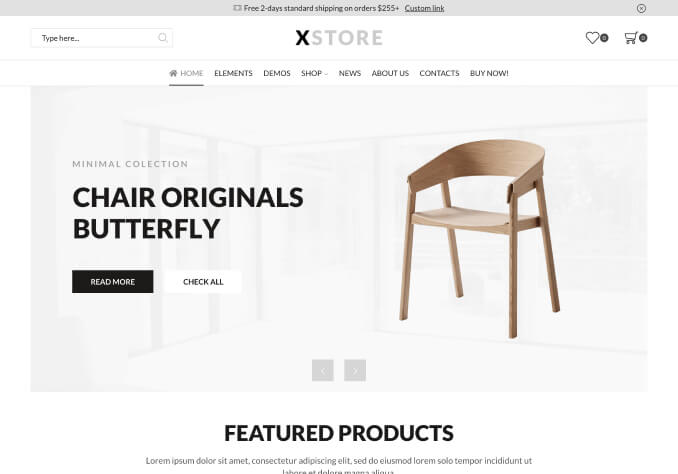
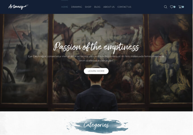
    Please note that in “Revolution Slider” same image is not visible fully in both i.e. Desktop & Laptop. Below is the screenshot of both :

    Desktop View Screenshot – https://prnt.sc/vhted9
    Mobile View Screenshot – https://prnt.sc/vhtcxy

    How to correct it…

    1 Answer
    Avatar: Olga Barlow
    Olga Barlow
    Participant
    November 12, 2020 at 12:03

    Hello,

    You have already asked about slider layout in one of the previous topics.
    You use bg image for the slider with bg-size cover, it means that image will cover the slide grid area http://prntscr.com/vhx8nz and

    Scales the image as large as possible without stretching the image. If the proportions of the image differ from the element, it is cropped either vertically or horizontally so that no empty space remains.

    https://developer.mozilla.org/en-US/docs/Web/CSS/background-size

    So, if you want to minimize cropping on the mobile device then set the Layer area size to fit your image proportions. For example, if your image is 1200×628 then set this width x height in the layer grid settings for the desktop and 480×251 for the mobile. Then you’ll get http://prntscr.com/vhxgvz

    Regards

  • Viewing 2 results - 1 through 2 (of 2 total)

The issue related to '‘Slider Revolution’' has been successfully resolved, and the topic is now closed for further responses

We're using our own and third-party cookies to improve your experience and our website. Keep on browsing to accept our cookie policy.