What width of image should be used in so that it is perfect in both mobile & pc?

This topic has 2 replies, 2 voices, and was last updated 5 years, 5 months ago ago by Olga Barlow

  • Avatar: Priya
    Rashika
    Participant
    July 1, 2020 at 20:04

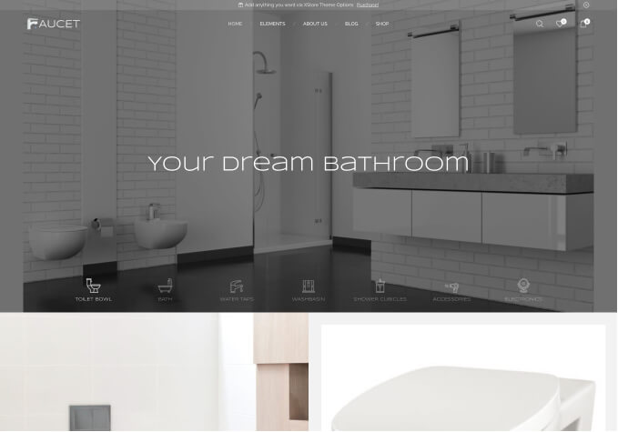
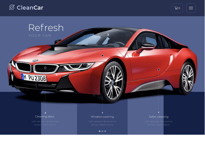
    The image i am reffering to is for slider that could be added in the elementary. You can see the slider on ,y website home page https://dailygo.co.in ., But this slider doesn’t work well on mobile. I am using 1100*390 for all the images on the slider but some are coming different than others on mobile version. Take a look here at the 4 sliders I have
    1 slider. https://prnt.sc/t9zpqi
    2 slider https://prnt.sc/t9zrd8
    The images in the slider have a dimension of 1100*390 and they are big for the slider so they are cut from the end.
    3 slider : https://prnt.sc/t9zsrg
    The 3rd slider also has the same dimension but it doesn’t fall big for the slider instead it’s short and therefore ahs lot os space left at the edges.

    How to fix this. What dimension should I use in order to show the images in the slider perfectly on both mobile and pc.
    Note: I am not using the revolution slider. I am the using the default on that come with you theme on elementor.
    2 slider :

    1 Answer
    Avatar: Olga Barlow
    Olga Barlow
    Participant
    July 2, 2020 at 12:47

    Hello,

    Our slider element uses images on the background with the bg-size cover. That’s why it’s cut for the different devices. If you want to show the full image I would recommend using of the Images carousel http://prntscr.com/taf13h element instead of the slider.

    Regards

  • Viewing 2 results - 1 through 2 (of 2 total)

The issue related to '‘What width of image should be used in so that it is perfect in both mobile & pc?’' has been successfully resolved, and the topic is now closed for further responses

We're using our own and third-party cookies to improve your experience and our website. Keep on browsing to accept our cookie policy.