Hello,
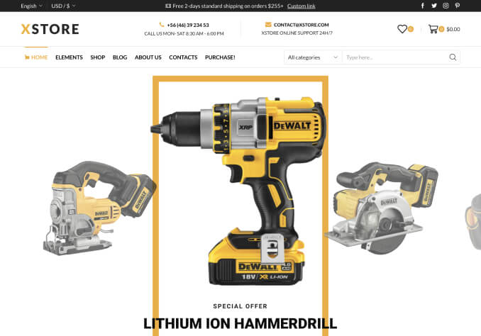
I would like to know how to make the background image for a row to full width responsive.
The image looks great on computer, but if I view it on a mobile, I can see only the middle section. It should display my whole image but smaller.
Also the text blocks does not fit correctly to mobile.
Can you tell me the settings that i must to set for adapt them?
When i change the settings of columns for mobile they change also the order for computer so is not good.
There is a analytical video with responsive instructions?
Thank you

