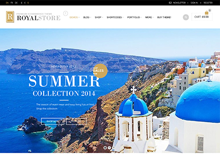
In Mobile Responsive Design, the Search Hand Lens is cutted

This topic has 4 replies, 2 voices, and was last updated 9 years, 6 months ago ago by Eva Kemp

  • Avatar: Webacto
    Webacto
    Participant
    June 4, 2016 at 08:21

    Please have a loook at the website in a mobile version:

    Althought the theme is responsive, I need to adjust some details like the search icon in the right side of the header. Now only half image it’s visualable, and I need a full and correct visualization of this component.

    From Iphone6 and Samsung CoreII, we match the same problem

    How to solve it?

    Please, contact administrator
    for this information.
    3 Answers
    Avatar: Eva
    Eva Kemp
    Participant
    June 4, 2016 at 08:58

    Hello,

    Please show a screenshot of the issue.
    I don’t see the problem you described:
    http://storage3.static.itmages.com/i/16/0604/h_1465027074_1786758_52ea66fbd3.jpeg

    Regards,
    Eva Kemp.

    Avatar: Webacto
    Webacto
    Participant
    June 4, 2016 at 11:11

    Ops!
    Sorry!

    Thansk you for solving so quickly!!!

    Avatar: Eva
    Eva Kemp
    Participant
    June 4, 2016 at 12:23

    Hello,

    You’re welcome.

    Regards,
    Eva Kemp.

  • Viewing 4 results - 1 through 4 (of 4 total)

The issue related to '‘in Mobile Responsive Design, the Search Hand Lens is cutted’' has been successfully resolved, and the topic is now closed for further responses

We're using our own and third-party cookies to improve your experience and our website. Keep on browsing to accept our cookie policy.