Hi,
There are three issues that I need help with:
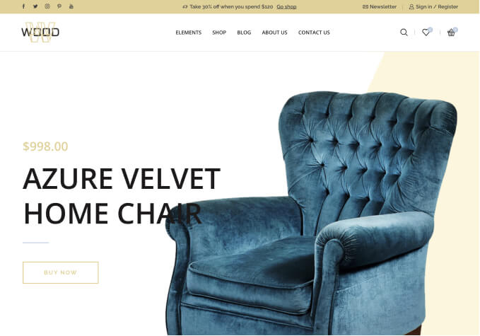
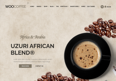
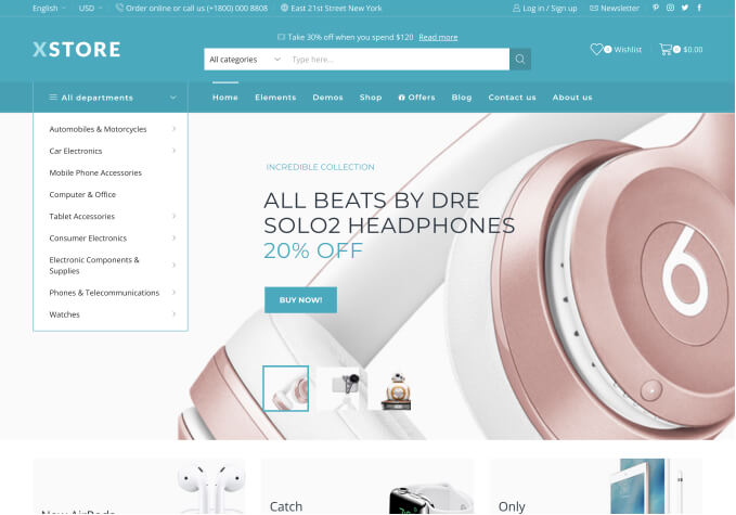
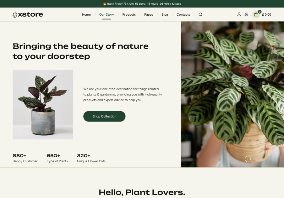
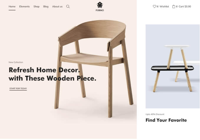
1. The main image for the responsive slider is not responsive. It changes the buttons and title layers responsively but not the main background image. How do I get that to shrink responsively for cell phone and ipad sizes.
2. The thumbnail images for the products are skewed. They are different widths and heights. Instead of stretching them to match the first product images size, I would like them to keep their aspect ratio and not stretched.
3. There are currently just 4 thumbnails for each product. I would like the option to have 5. How would I change the number of thubnails shown?
Thanks so much for your help!
Nisha


