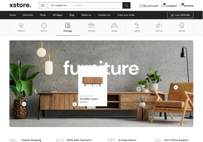
Double header appear after theme update 8.0

This topic has 10 replies, 3 voices, and was last updated 2 years, 2 months ago ago by Rose Tyler

  • Avatar: vincentdv
    vincentdv
    Participant
    July 23, 2021 at 06:00

    Hi good day.
    Double header appeared on my website after theme update to version 8.0 yesterday.
    Same problem on desktop and mobile view.
    But it backs to normal on desktop suddenly, not sure why.
    On mobile view, issues persist.

    May I know what is the setting that I should remove to solve this problem? thank you

    Please, contact administrator
    for this information.
    9 Answers
    Avatar: Olga Barlow
    Olga Barlow
    Support staff
    July 23, 2021 at 16:41

    Hello,

    Probably you have some CSS error in the mobile custom CSS. Provide us with WP Dashboard access to check.

    Regards

    Avatar: vincentdv
    vincentdv
    Participant
    February 2, 2022 at 09:06

    On desktop, most of the time header will be using mobile header as well.
    How can I have the desktop header on desktop?
    This only happens after the theme update, prior to theme update 8.0 all are working fine.

    and double header appeared, I need to hide the second header using header overlap function, but i think that’s not the correct way to solve it. The top part of website were hidden by the top header. As you can see from screenshot no 2 and 3, the top part were cut, it couldn’t be shown in full.

    Please contact administrator
    for this information.
    Avatar: Olga Barlow
    Olga Barlow
    Support staff
    February 2, 2022 at 17:03

    Hello,

    Cache plugin that you use do not have separate cache for the mobile devices https://wordpress.org/support/topic/how-to-create-mobile-seprate-cache/ So, don’t enable Theme Options > General > Mobile Content Optimization option. And also don’t use AMP plugin because looks that your cache plugin caches that too. Or contact plugin author and ask how to avoid caching of the mobile version of site for the desktop.

    Regards

    Avatar: vincentdv
    vincentdv
    Participant
    February 2, 2022 at 23:37

    I have checked, the mobile content optimization option has never been enabled. Please check screenshot.

    And my question is regarding Desktop header. Not sure why on desktop, mobile header is used instead of desktop header.
    And the top part of page content is being cropped/hidden by part of the header.
    How to solve this? you may refer. to screenshot in my previous reply. Thank yoou.

    Please contact administrator
    for this information.
    Avatar: Olga Barlow
    Olga Barlow
    Support staff
    February 4, 2022 at 10:57

    Hello,

    You did not close the media query in custom CSS and that’s caused the issue.
    Be attentive while adding custom code. Check now.

    Regards

    Avatar: vincentdv
    vincentdv
    Participant
    February 4, 2022 at 16:03

    thank you.
    May I know how to add more margin at the top part of single product page? or otherwise currently it is a bit hidden by the header.

    Please contact administrator
    for this information.
    Avatar: Rose Tyler
    Rose Tyler
    Support staff
    February 5, 2022 at 09:19

    Theme Options > Header builder > Header overlap > disable the overlap. If you need overlap effect on a particular page, use the Multiple headers feature – https://youtu.be/BpeXfzNwkOc
    Also, add the next code in Theme Options > Theme custom CSS:

    .single-product .content-page {
        margin-top: 35px;
    }

    Regards

    Avatar: vincentdv
    vincentdv
    Participant
    February 12, 2022 at 02:57

    1)May I know how to remove this empty space on mobile checkout page?

    2) how to add margin-top for shop page? for mobile view

    Thank you.

    Please contact administrator
    for this information.
    Avatar: Rose Tyler
    Rose Tyler
    Support staff
    February 12, 2022 at 08:08

    Hello,

    1/ Theme Options > Header builder > Header overlap > mobile > Custom Breadcrumbs Paddings > change Padding top
    2/ Theme Options > Header builder > Header overlap > mobile > disable the overlap, go to Edit page and enable the breadcrumbs ( https://prnt.sc/26u94cf – this means settings for breadcrumbs will be taken from Theme options).

    Regards

  • Viewing 10 results - 1 through 10 (of 10 total)

You must be logged in to reply to this topic.Log in/Sign up

We're using our own and third-party cookies to improve your experience and our website. Keep on browsing to accept our cookie policy.