This topic has 104 replies, 5 voices, and was last updated 8 years, 9 months ago ago by Eva Kemp
Good Day Support,
I’ve noticed the following possible ” Bug ” when scrolling true the website on a mobile (Samsung Galaxy S5):
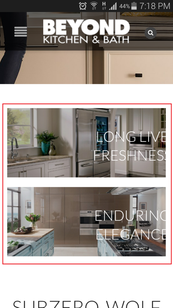
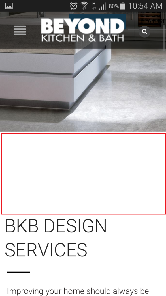
1.) It is noticed that when I turn the screen vertical or horizontal it is missing some text or not aligning the text as should in order to be visible on the screen (I’ve colored where I am pointing in color red):
http://i1340.photobucket.com/albums/o728/LibardoBarreto/xcvxcvxcv_zpsjiybpoc6.png
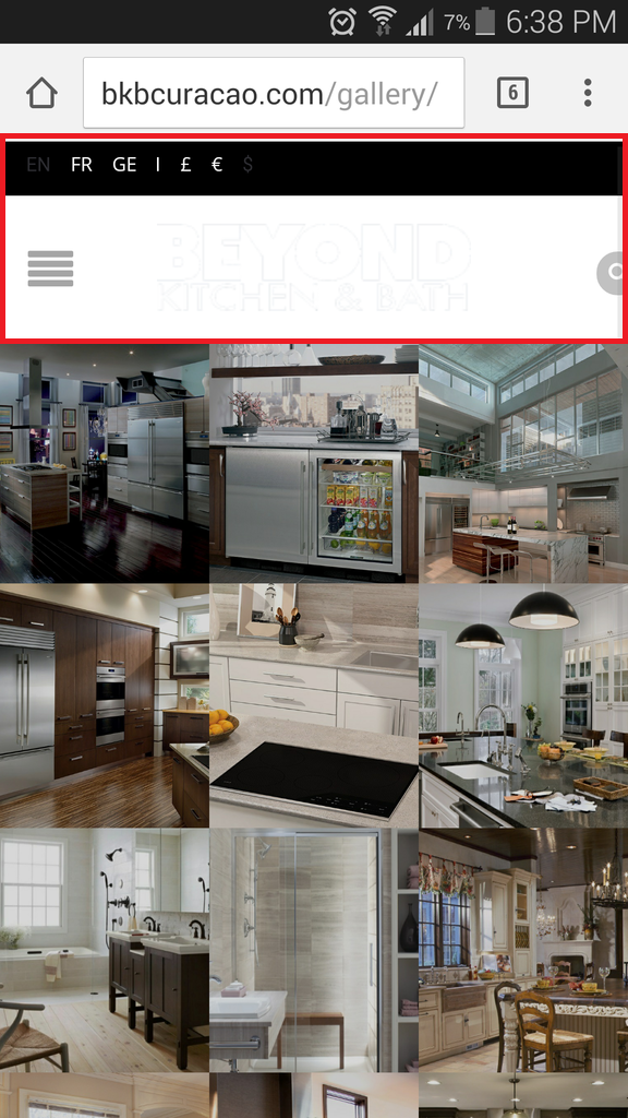
2.) Also when the phone is showing vertical it is showing the correct way but when I turn the phone horizontal it shows as follow:
http://i1340.photobucket.com/albums/o728/LibardoBarreto/34234_zpswfa0yyzf.png
Meaning the white bar (Where the logo is showing) needs to be black and also the language/currency field is showing again which was reported to be removed in ticket#52269
Kindly please look into this so we can work for a solution … Thank you 8theme 🙂
Hello
Please put this code into the custom.css to fix top bar issue:
.fixed-header-area{background:black;border:none;}
.header-content{background:black;}
.top-bar{display:none}
With best regards
Brian Johnson
Good Day Brian,
This code is for request 1.) Or 2.) Or both??
Good Day Brian,
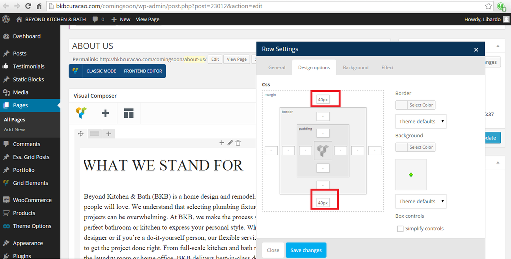
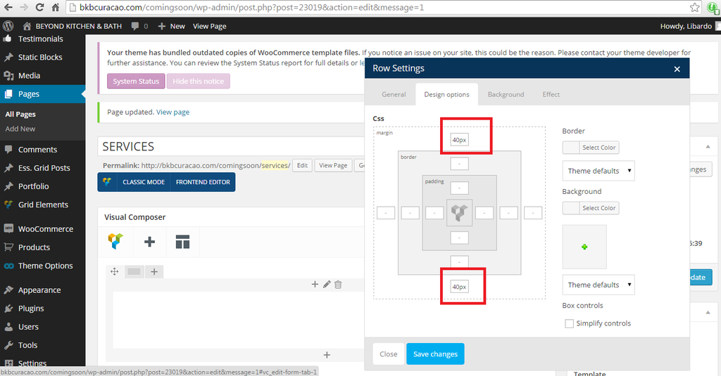
With respect to my reply below which in the meantime I am waiting for your confirmation I also noticed the following in addition to my reply above:
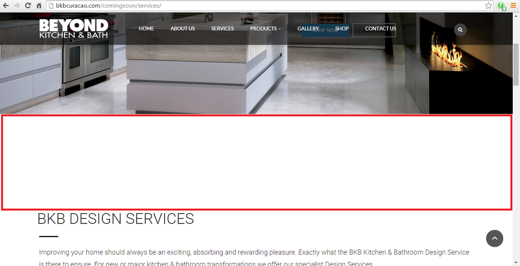
The padding for Services and About us Page is showing the same but when I show this on a desktop or mobile (Samsung Galaxy S 5) is showing wrong:
http://i1340.photobucket.com/albums/o728/LibardoBarreto/5ttt_zpsjxmhrbfd.png
http://i1340.photobucket.com/albums/o728/LibardoBarreto/gg555_zpskwpvo4li.png
http://i1340.photobucket.com/albums/o728/LibardoBarreto/vvbrger_zpspnmjm2fw.png
Kindly have a look into About Us and Services Pages. Login credentials in >> ( Private ) <<
Hello
Previous code should fix your header color layout. Please provide us with the link to the page where margins values are too high.
With best regards
Brian Johnson
See in private.
Ok what about this one?
1.) It is noticed that when I turn the screen vertical or horizontal it is missing some text or not aligning the text as should in order to be visible on the screen (I’ve colored where I am pointing in color red):
http://i1340.photobucket.com/albums/o728/LibardoBarreto/xcvxcvxcv_zpsjiybpoc6.png
P.S All information are in this ticket not sure why we are skipping every time some request and then need to repeat to check once more ..
Hello
1.Please put this code into the custom.css:
@media only screen and (max-width: 916px){.banner.valign-middle .banner-inner{
left:10px !important;
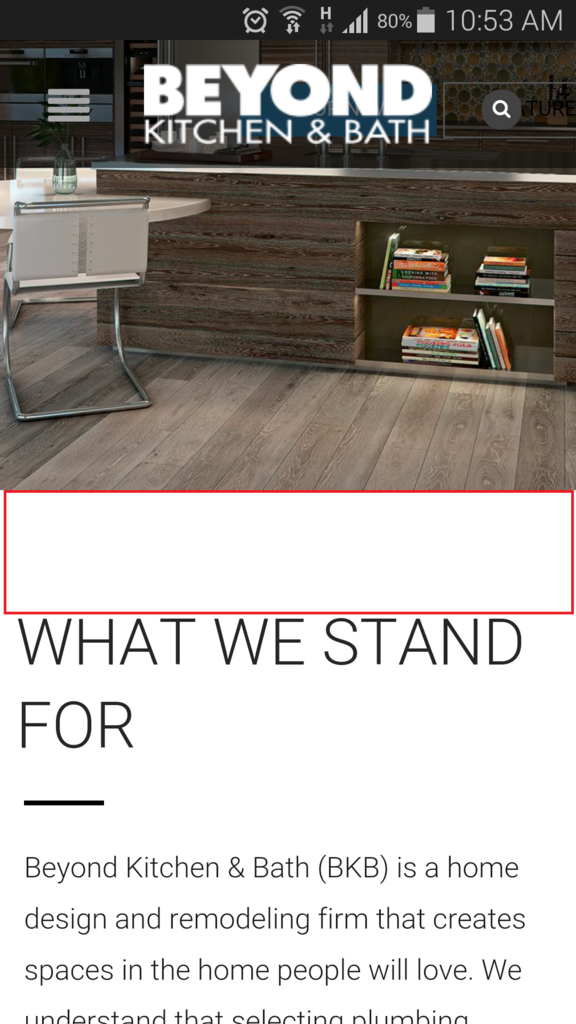
}}2.Please check these pages layout as it seems that white space caused by the additional empty row with empty text VC element within.
With best regards
Brian Johnson
Thanks Brian.
With respect to :
2.Please check these pages layout as it seems that white space caused by the additional empty row with empty text VC element within.
How to check or where to check these? Or can you eliminate them? I approve to clear the white space.
1. I have removed blank row with “ ” VC text element for first page in private content and changed margin-top value to zero in VC settings for the second page. Please check your site now.
2. Sorry i changed css code for mobile layout in previous message as it was for wide screens and now for mobile devices.
With best regards
Brian Johnson
Thanks Brian.
When you say ( 2. Sorry i changed css code for mobile layout in previous message as it was for wide screens and now for mobile devices. ) was this change for one of the pages? Please advise which ..
At the moment I’ve included this code :
@media only screen and (max-width: 916px){.banner.valign-middle .banner-inner{
left:10px !important;
}}
For the following Pages(See in private)
BRIAN WHAT HAVE YOU DONE WITH THE ABOUT US AND THE SERVICES PAGE??????????????????????
I’M MISSING THINGS ON THE ABOUT US PAGE AND THE SERVICES PAGE???????????????????????????
CAN SOMEBODY ELSE TAKE OVER THIS TICKET#????????????????????????
THIS IS NOT A JOKE OR CAN FOOL WITH THIS TICKET I AM CURRENTLY IN THE PHASE OF GOING LIVE WITH THIS WEBSITE AND HAVE A VERY TIGHT SCHEDULE AT THE MOMENT TO COMPLETE THIS. NOT MY RESPONSIBILITY TO SHOW YOU WHAT IS MISSING IN THESE PAGES. I WANT TO SEE WHAT IS REMOVED BACK IN MY PAGES.
LOOK AT MY WEBSITE PAGES:
http://bkbcuracao.com/comingsoon/services
http://bkbcuracao.com/comingsoon/about-us
AND FIGURE OUT WHAT NEEDS TO BE PUT BACK IN ORDER. I DID NOT APPROVE TO DELETE THINGS FROM THE PAGE I APPROVE TO :
( How to check or where to check these? Or can you eliminate them? I approve to clear the white space. )
FIXXXX THISSSSSS!!!!!!!!!!
Where is this Image?
https://s3.amazonaws.com/fvd-data/notes/168674/1427797513-ZKyk4D/screen.png
Where is this Image?
http://i1340.photobucket.com/albums/o728/LibardoBarreto/weqwr_zpspun0o6zt.png
THESE ARE JUST PARTS OF THE PAGES THAT ARE GONE???????? HOW COME THESE ARE GONE???????? AND STILL THERE ARE SOME OTHER INFO THAT I CANNOT FIND PROOFS OR PICTURES TO SHOW THIS. BUT I TRUST THAT 8THEME DOES NOT DELETE CONTENT WHICH WAS NOT INFORMED TO DO SO. WHY ARE THESE MISSING?
Hello,
Do you have back up of your files and database?
Please contact your host and ask them to restore your database and files from the back up.
Thank you.
Regards,
Eva Kemp.
Ok I will check. But was the caused that the files/data from the website disappear?
Hi Support,
Any update?
Hello,
Sorry, but we don’t know what was the reason. You need check error logs and ftp logs on a server at your host.
Regards,
Eva Kemp.
Good Day Eva,
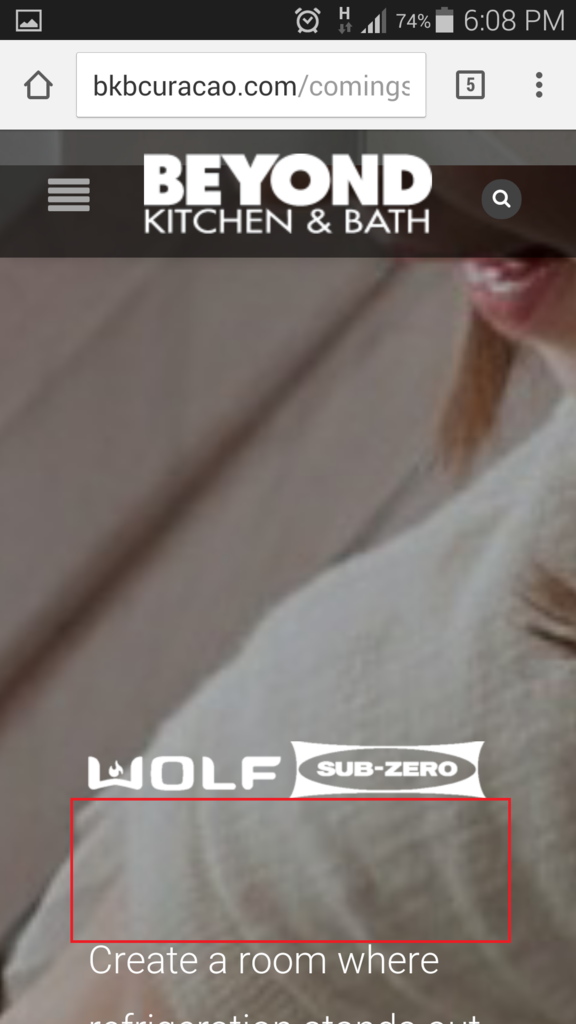
When I scroll true the following pages I noticed when I view them on a PC workstation the spacing looks good as should. However when I view them on a tablet or a mobile I see the following:
bkbcuracao.com/comingsoon/kohler
bkbcuracao.com/comingsoon/subzero-wolf
bkbcuracao.com/comingsoon/techlingting
bkbcuracao.com/comingsoon/grabill
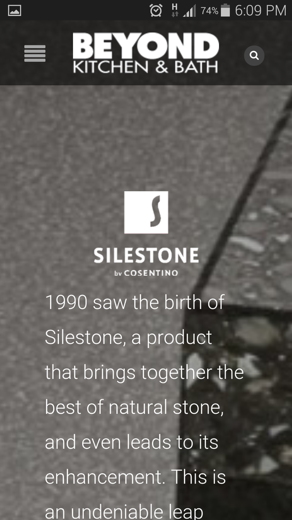
bkbcuracao.com/comingsoon/silestone
Is it possible for all to have the same spacing as below:
Hello,
Please try to use this code in custom.css file:
@media (max-width: 480px) {.wpb_text_column p:last-child, .wpb_text_column *:last-child {
line-height: 1.5 !important;
}
.vc_custom_1427424033615 {
  margin-bottom: -50px !important;
}}
Regards,
Eva Kemp.
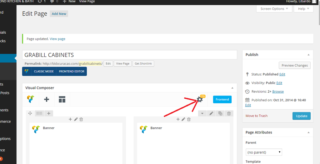
Hi Eva,
I’ve included the code above into the CSS Menu:
http://i1340.photobucket.com/albums/o728/LibardoBarreto/gdfgd_zpsktcz6ohh.png
But still it is showing like this when I check on mobile:
All of them needs to look like this with a spacing under the logo product:
You must be logged in to reply to this topic.Log in/Sign up


